SPECIAL OFFER ✦ BUY 2 GET 1 FREE! ✦ ADD 3 PRODUCTS TO YOUR CART, AND THE DISCOUNT APPLIES AUTOMATICALLY!
SPECIAL OFFER ✦ BUY 2 GET 1 FREE! ✦ ADD 3 PRODUCTS TO YOUR CART, AND THE DISCOUNT APPLIES AUTOMATICALLY!
SPECIAL OFFER ✦ BUY 2 GET 1 FREE! ✦ ADD 3 PRODUCTS TO YOUR CART, AND THE DISCOUNT APPLIES AUTOMATICALLY!
SPECIAL OFFER ✦ BUY 2 GET 1 FREE! ✦ ADD 3 PRODUCTS TO YOUR CART, AND THE DISCOUNT APPLIES AUTOMATICALLY!
Thinking about how to choose brand colors can feel overwhelming with so many combinations to consider. In reality, picking a brand color isn’t just about selecting the most beautiful one. Rather, it’s about how that color helps build a strong visual communication strategy.
As Cunningham states, some consumers may view color as merely decorative. However, marketing strategies utilize color to reach consumers’ emotions more deeply and stand out in the market compared to competitors.
Key takeaways:
Brand colors are important for shaping the audience’s perception and emotions towards a brand.
The way to choose a brand color is to start by exploring the meaning of colors, considering the target audience, and conducting trials.
Well-known brands recognized for their iconic color palettes include Ortega, Instagram, Slack, Netflix, and Mastercard.
What are Brand Colors?
Brand colors are a set of colors chosen to represent a brand’s visual identity. These colors are selected carefully because they’re often the first thing consumers notice when they see your product.
Moreover, according to Digitalsilk, brand recognition can increase by up to 80% when a business uses a distinctive color scheme. For example, when thinking of Facebook, the dominant blue color immediately comes to mind because Facebook uses a blue and white color scheme in its logo, website, and applications.
When choosing brand colors, designers should focus on the message they want to convey to consumers rather than on personal preferences. Follow the step-by-step choosing brand colors section below to help you find the right colors that match your brand identity.
1. Explore the Meaning of Each Color
You need to understand the psychology of the colors you will use for your brand because each color can evoke certain feelings. For instance, red often represents love, danger, and passion, so it’s most likely suitable for fast-food brands that want to grab attention quickly.
Another example is green, which is associated with health and relaxation. This color is right for healthy food products or products with a sustainable concept.
2. Consider Your Target Audience
Who is your target audience? What colors are suitable for conveying your brand’s values and story to your target market? You need to answer these questions when choosing the brand colors.
If you have beauty products and are targeting a young audience, bright and cheerful colors might be a good choice.
3. Analyze Competitors
Before deciding on a brand’s colors, research the brand colors used by similar competitors. The goal is not to imitate, but to ensure that your brand is not mistaken for another brand, which could weaken your unique identity.
Be different by choosing colors that make your brand more memorable. For example, if your competitors use a combination of red and yellow, you might consider alternatives like orange and green.
4. Select Primary, Secondary, and Neutral Colors
You can use a color wheel as a visual guide to select primary and secondary colors. Examples of primary colors that can be chosen include red, yellow, or blue.
Then, choose two to four secondary colors to combine with the primary colors. Don’t forget that you also need neutral colors, which are often used as backgrounds. Common options are gray, cream, and white.
5. Pick Colors that Serve Different Functions
A brand usually has two to six color combinations, each serving a different purpose. There’s often a main color used in the logo, like the red in YouTube’s logo.
Then, there are accent colors used to highlight elements such as call-to-action buttons to encourage users to click. It’s best to use an eye-catching color for these areas so they stand out easily.
6. Create a Brand Color Palette
One of the key steps in learning how to choose brand colors is creating a color palette. This color palette will be the main visual guide that maintains design consistency across all platforms, from logos to websites and applications.
To make it easier to find the right palette, note down the HEX code for each color you have chosen.
7. Testing Brand Colors
To determine whether your chosen palette fits your brand identity, you need to test your brand colors. Place all the colors together and explore different combinations and compositions until you find the balance that feels right for your brand.
Once you understand how to choose brand colors, it’s time to look at examples from real brands for inspiration!
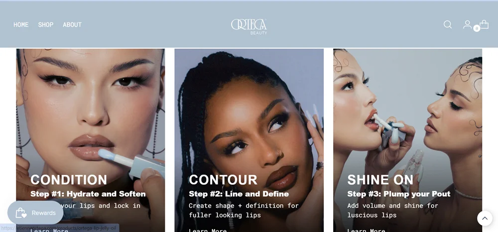
1. Ortega
Cool light blue in the Ortega website | Source: Ortega
The popular cosmetics brand Ortega uses a cool light blue as its main color for product photography backgrounds, website banners, and packaging design. The website also incorporates gradients of light and dark blue that create a calm and refreshing visual effect.
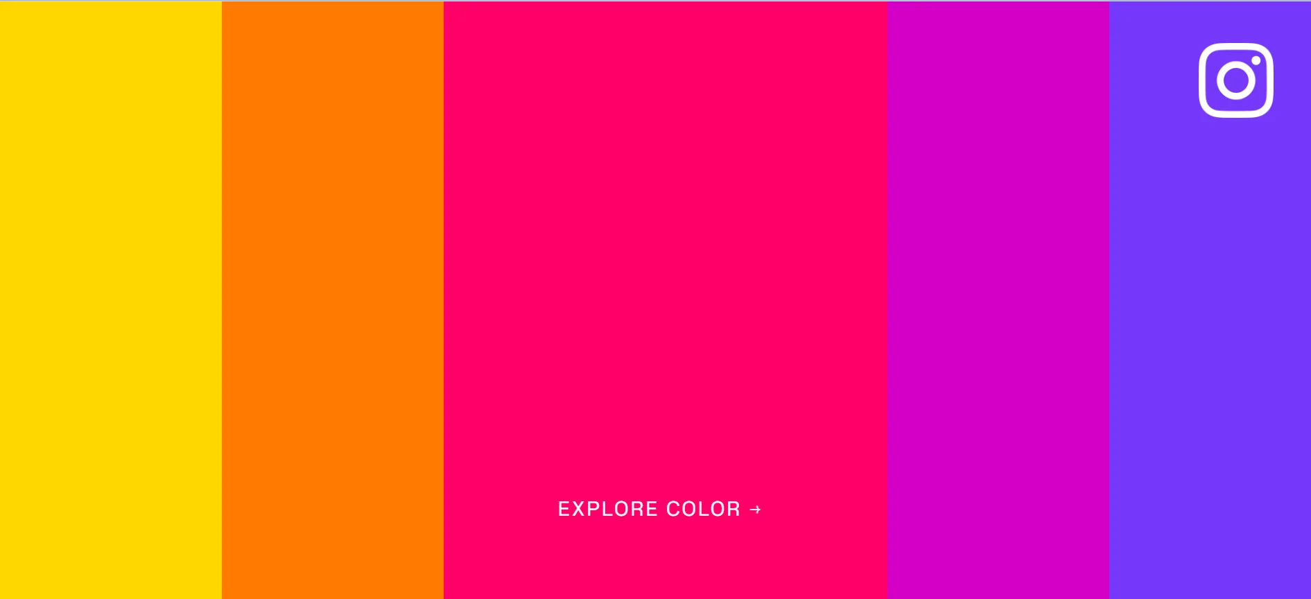
2. Instagram
Color pallette of Instagram | Source: Instagram
Instagram’s signature color scheme features a gradient from blue to yellow, blended with purple, pink, and orange tones. This five-color gradient is consistently used in its story ring and app icon.
3. Slack
A deep purple shade in the Slack website | Source: Slack
Slack uses aubergine, a deep purple shade, as its main color. However, this color is not used in the logo, which instead uses a combination of blue, green, yellow, and red.
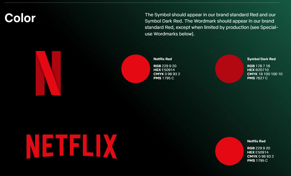
Red and black brand colors of Netflix | Source: Netflix
As one of the world’s leading streaming platforms, Netflix uses a bold red for the “N” in its logo, paired with a black neutral background. This high-contrast color combination makes the brand easily memorable.
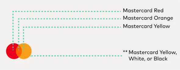
5. Mastercard
Colors in the Mastercard logo | Source: Mastercard
Mastercard’s logo features two overlapping circles. The left in red, the center in orange, and the right in yellow. This color palette gives a bright and energetic impression.
After finding enough inspiration for your brand colors, the next step is to make use of 3D assets such as shapes, backgrounds, or animations from Tridimensi Pro, which align with your brand’s color identity.
These versatile visual assets can be used for various branding purposes, including social media content, product packaging, and UI design to help your brand look more professional and engaging.