SPECIAL OFFER ✦ BUY 2 GET 1 FREE! ✦ ADD 3 PRODUCTS TO YOUR CART, AND THE DISCOUNT APPLIES AUTOMATICALLY!
SPECIAL OFFER ✦ BUY 2 GET 1 FREE! ✦ ADD 3 PRODUCTS TO YOUR CART, AND THE DISCOUNT APPLIES AUTOMATICALLY!
SPECIAL OFFER ✦ BUY 2 GET 1 FREE! ✦ ADD 3 PRODUCTS TO YOUR CART, AND THE DISCOUNT APPLIES AUTOMATICALLY!
SPECIAL OFFER ✦ BUY 2 GET 1 FREE! ✦ ADD 3 PRODUCTS TO YOUR CART, AND THE DISCOUNT APPLIES AUTOMATICALLY!
Mastering essential types of infographics is fundamental for designers transforming complex data into compelling visual stories. Recent findings from Demansage quantify this impact, revealing that visual content generates a 650% higher engagement rate and infographics are 30 times more likely to be read in their entirety.
This guide examines 10 top infographic types to select the perfect format for specific client needs.
Key Takeaways
Select the right infographic type to match your client’s core communication goal and message.
Structure complex information visually to make it instantly understandable for your audience.
Apply strategic visual design to significantly boost audience engagement and information retention.
What Are Infographics?
Infographics are strategic visual tools that translate complex data into a clear and compelling story. They break down intricate subjects for better understanding and recall by merging elements like charts, icons, and minimal text.
This approach works effectively because it aligns with our brain’s natural strength in processing visuals quickly. Ultimately, they serve as powerful communication assets to convey messages with more impact than raw data or text alone.
How to Choose the Type of Infographic
With distinct formats available, selecting the most effective one for your project can be a challenge. Your decision should primarily be guided by the nature of your content and the specific story you need to convey. To make the right choice, follow these steps to match your content with the perfect visual format.
Define your communication purpose: Determine if you need to inform, compare, show trends, or explain a process.
Analyze your content type: Assess if information is data-driven, geographical, chronological, or narrative.
Understand your audience: Adapt complexity and style to their background knowledge.
Consider the platform requirements: Adjust layout and detail for social media, reports, or presentations.
Ensure visual effectiveness: Verify the format enhances understanding through clear structure.
Maintain brand consistency: Select a style that aligns with your visual identity.
Plan for shareability: Choose approaches that encourage interaction and distribution.
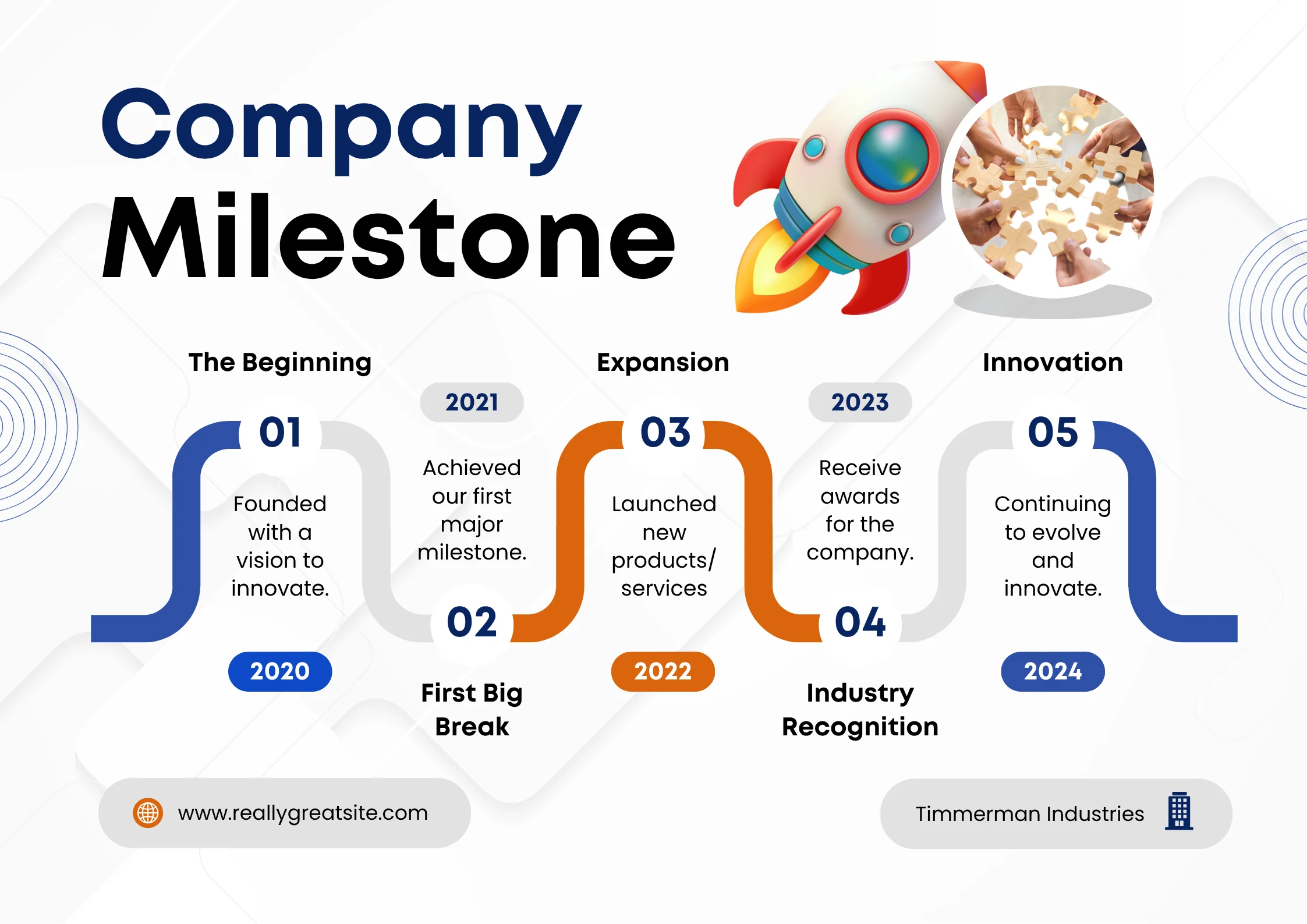
Timeline infographics transform complex historical sequences into clear, engaging narratives that flow chronologically. They’re particularly effective for showcasing company growth or product development in a way that keeps readers engaged from start to finish.
For instance, presenting a company’s 5-year evolution through this format ensures the story is both comprehensive and easily digestible. This approach turns what could be dry historical data into a compelling visual journey.
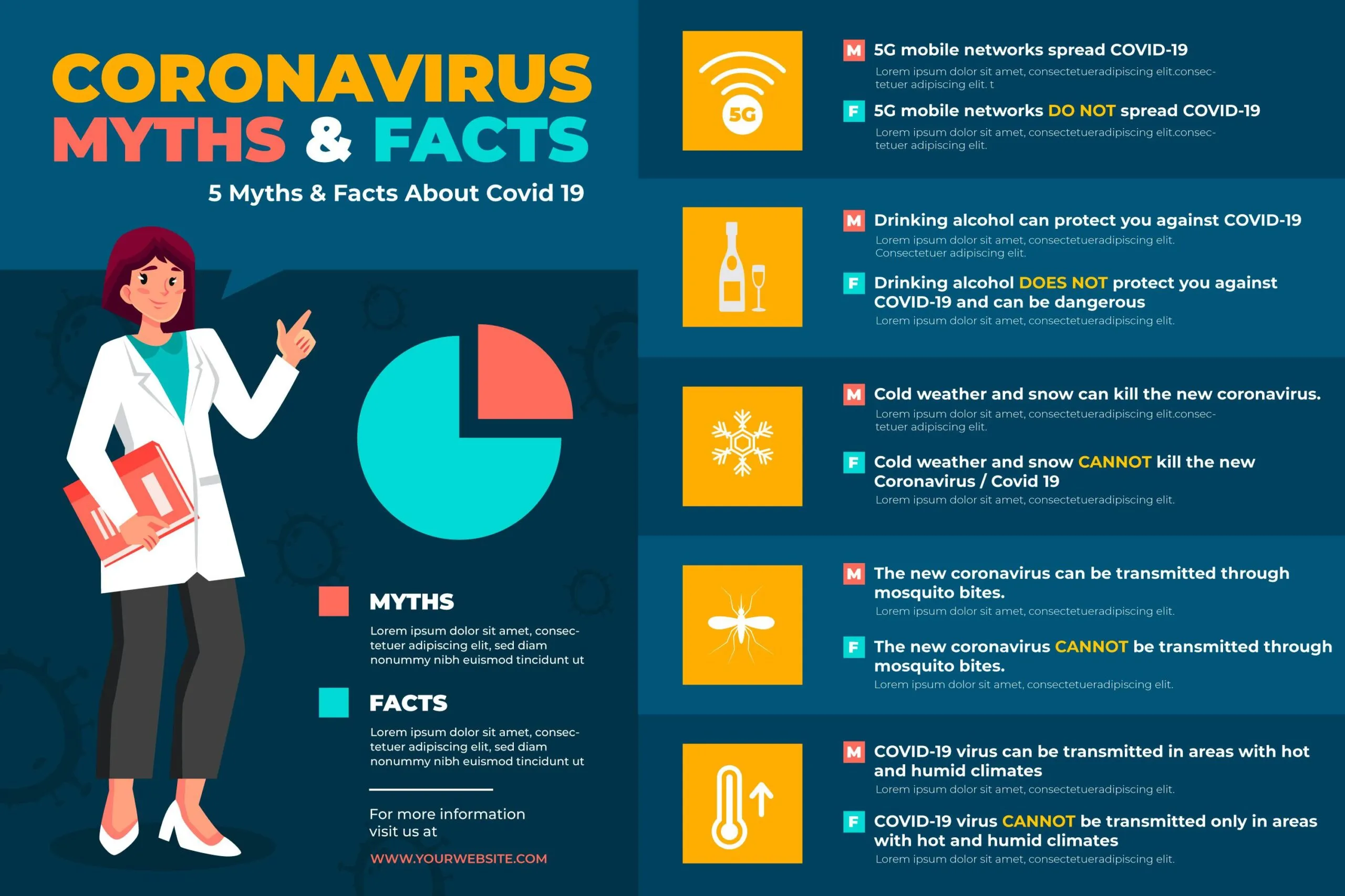
As one of the most versatile types of infographics, this format breaks down complex subjects into organized and visually appealing sections. Think of them as smart visual summaries that make challenging topics approachable and worth reading.
Therefore, they work exceptionally well for blog content and educational materials where clarity is crucial. Their design naturally encourages sharing while improving information retention.
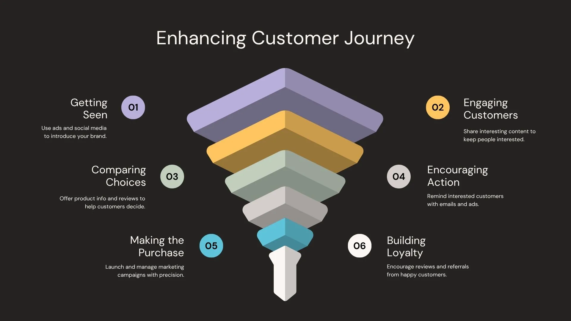
3. Process Infographics
Process Infographics (Source: Canva – Granz Creative)
These infographics excel at clarifying multi-step procedures. They guide viewers through logical sequences using intuitive visual cues like flowcharts and numbered steps.
In practice, they’ve become essential for training materials where visual guidance helps team members learn procedures faster than text-heavy documents. This method transforms complicated instructions into clear visual guides.
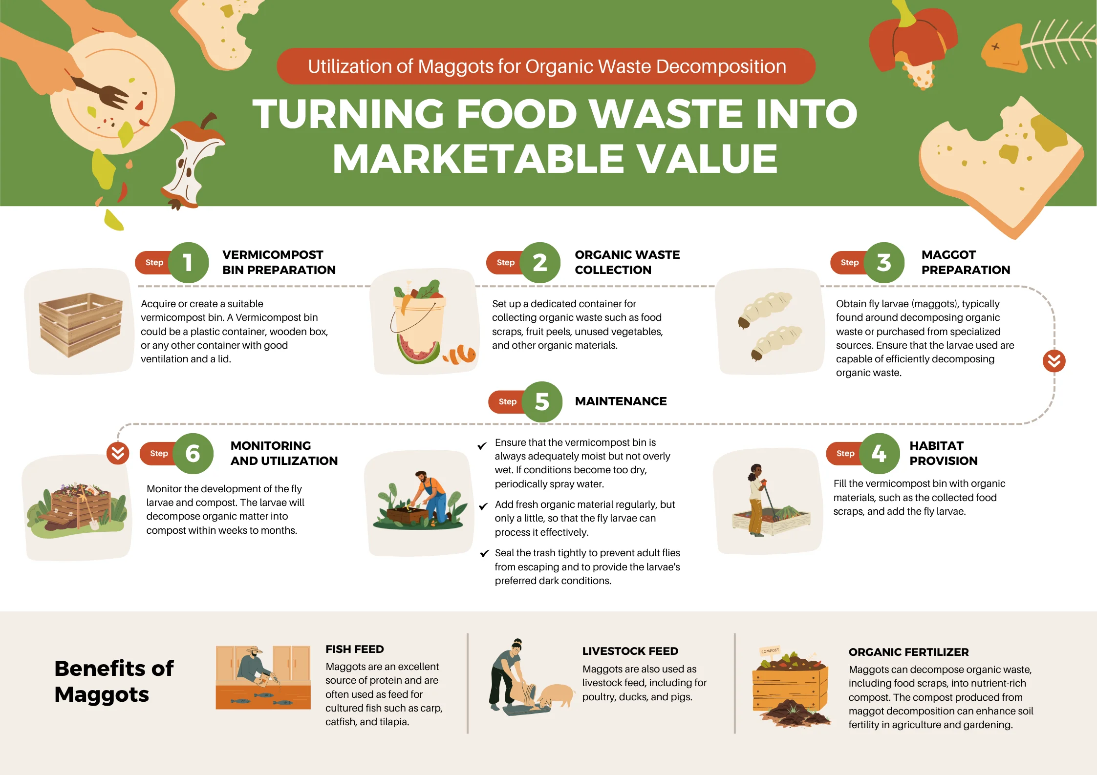
Focused on teaching practical skills, how-to infographics use step-by-step layouts that demonstrate processes through smart imagery and concise text.
This approach proves incredibly effective for tutorials. For example, infographics that teach practical ways to manage organic waste by using maggots as animal feed and fertilizer, presented in step-by-step visual guides, as shown in the image. The design is given in clear visual guides that make the process easy to follow.
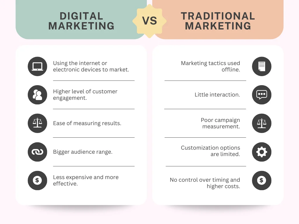
5. Comparison Infographics
Comparison Infographics (Source: Canva – Leonoro)
Representing key different types of infographics, these visuals deliver clear side-by-side analyses to support decision-making. They systematically contrast products or strategies using smart visual arrangements that highlight differences. They’re perfect for purchase decisions where demonstrating why one marketing strategy outperforms another provides immediate value to clients.
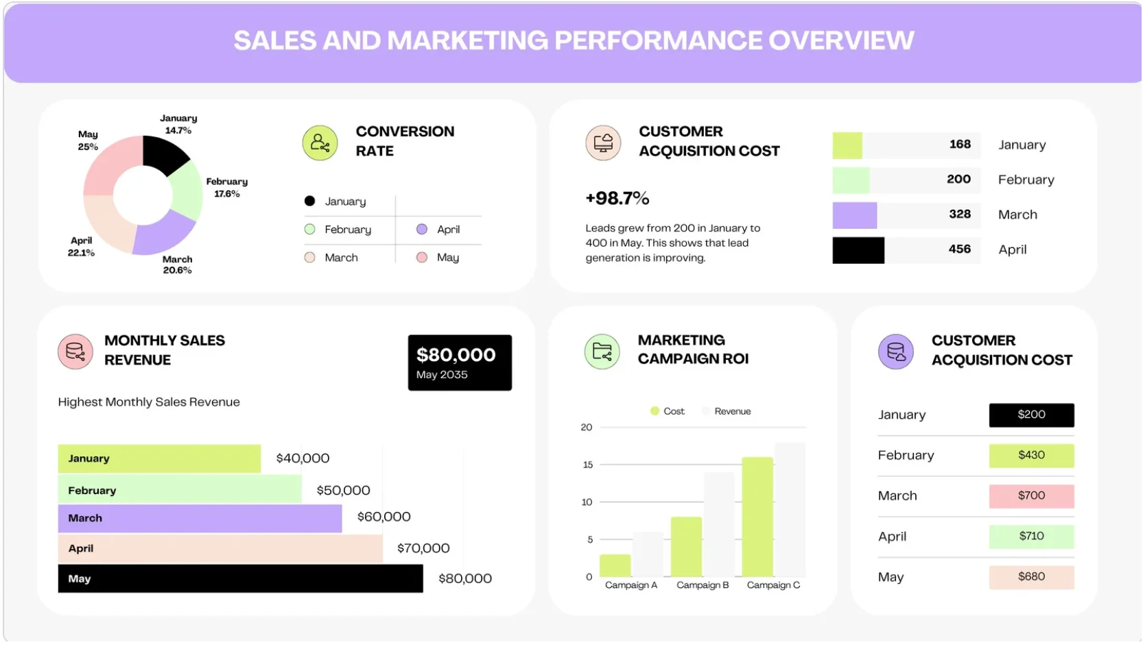
6. Statistical Infographics
Statistical Infographics (Source: Impro Studio)
As fundamental types of infographics, these visuals transform raw data into narratives through charts and bold data points. In particular, this infographic excels at presenting survey or research results in a way that is easier to understand and remember.
You can see an instance in the image above, a bar chart and line diagram that present sales and marketing performance data. For example, the 98.7% lead growth and the highest revenue in May are displayed visually to facilitate trend analysis.
These infographics create spatial understanding by tying data to specific geographic points through customized maps. They effectively display demographic statistics and market penetration across regions in a recognizable visual language.
This format organizes complex information into clear levels of importance using pyramids or tree diagrams. They perfectly illustrate organizational structures and classification systems where understanding relationships and authority levels needs to be understood. Their visual hierarchy clarifies complex chains of command and categorical relationships.
9. Interactive Infographics
Interactive Infographics (Source: thinglink.com)
Representing an innovative category of types of infographics, these dynamic visuals transform viewing into active exploration through clickable elements. They’re particularly effective for web-based reports that require in-depth data exploration, such as data journalism, scientific visualizations, and financial reports.
For example, an interactive infographic about the “Carbon Cycle” illustrates a complex scientific topic. It allows users to click on elements such as human activity, gas transfer, and feeding, among others.
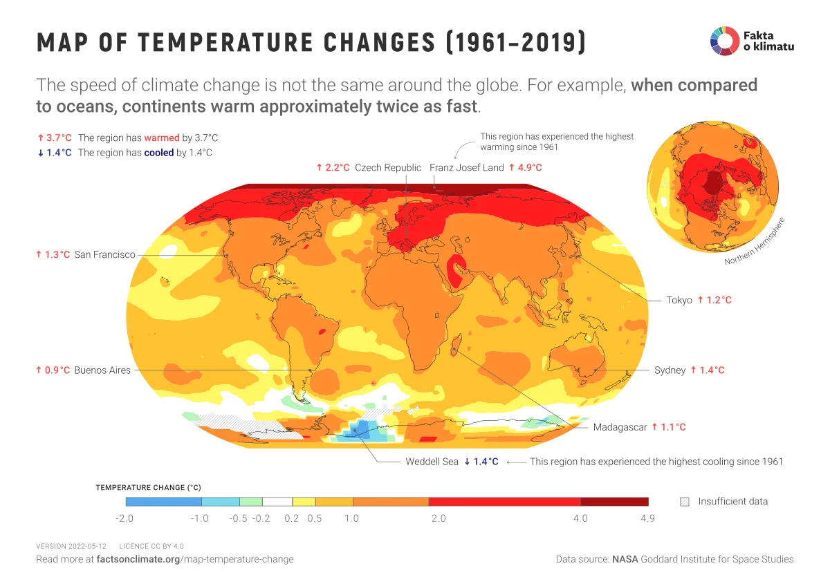
10. Geographical Infographics
Geographical Infographics (Source: Climate)
These specialized infographics use heat maps and symbolic data to reveal spatial patterns and regional comparisons. They clearly demonstrate, for instance, climate change impacts or earth structure variations where geographical distribution tells the complete story.
Their strength lies in visualizing location-based information that would otherwise require multiple traditional charts.
Build More Engaging Infographics
Above are 10 effective infographic types and their best uses. Each has a different purpose, depending on the message you want to convey. Consider this before deciding which one to choose.
Now that you understand the essential types of infographics, enhance your data stories using 3D Elements for Infographics from Tridimensi. Explore our library of 5,000+ premium 3D assets, including shapes, backgrounds, and animations specifically designed for data visualization, so you can transform your infographics into immersive visual experiences for any project need.