SPECIAL OFFER ✦ BUY 2 GET 1 FREE! ✦ ADD 3 PRODUCTS TO YOUR CART, AND THE DISCOUNT APPLIES AUTOMATICALLY!
SPECIAL OFFER ✦ BUY 2 GET 1 FREE! ✦ ADD 3 PRODUCTS TO YOUR CART, AND THE DISCOUNT APPLIES AUTOMATICALLY!
SPECIAL OFFER ✦ BUY 2 GET 1 FREE! ✦ ADD 3 PRODUCTS TO YOUR CART, AND THE DISCOUNT APPLIES AUTOMATICALLY!
SPECIAL OFFER ✦ BUY 2 GET 1 FREE! ✦ ADD 3 PRODUCTS TO YOUR CART, AND THE DISCOUNT APPLIES AUTOMATICALLY!
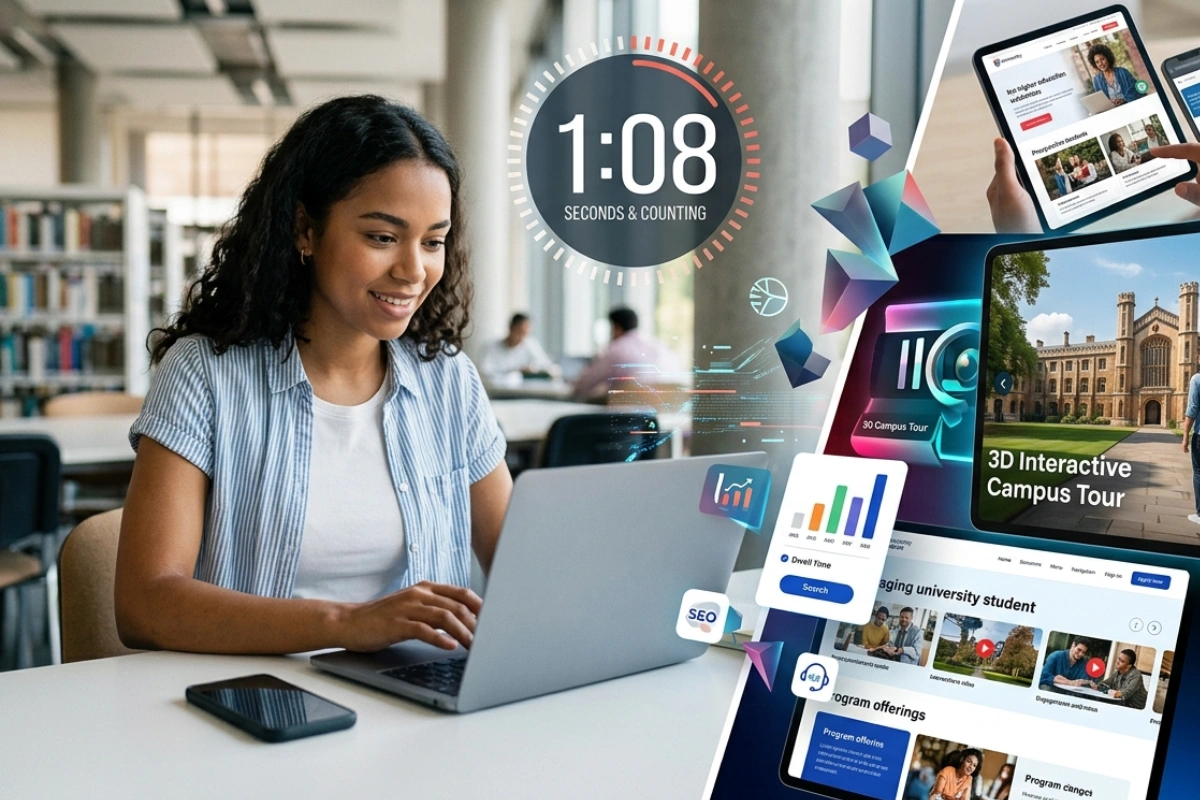
What makes a prospective student stay on a university website for more than eight seconds instead of clicking away to a competitor? The answer almost always comes down to higher education website design.
In an era when students research, compare, and apply to schools entirely online, your website is often the first impression your institution makes, and first impressions determine whether a visitor becomes an applicant.
Why Higher Education Website Design Matters More Than Ever
A slow or outdated university website can quietly signal to prospective students that the institution itself is behind the times.
Universities and colleges no longer compete only on academic reputation; they compete on digital experience. A slow, cluttered, or outdated website signals to prospective students that the institution itself may be behind the times. Strong higher education website design communicates credibility before a single word of content is even read.
Today’s students are digital natives who expect the same smooth browsing experience they get from Netflix or Spotify. If a university site takes too long to load or looks confusing on mobile, visitors bounce within seconds. This behavior directly affects enrollment numbers, since most prospective students shortlist schools based on how professional and trustworthy the website feels.
Beyond aesthetics, a well-designed higher education website also supports SEO visibility, accessibility compliance, and lead generation for admissions teams. It becomes a 24/7 recruitment tool that works even while the admissions office is closed. This is why design decisions on a university website should never be treated as a purely cosmetic exercise.
What Is the Future of Design in Higher Education?
Universities are moving toward personalized, immersive experiences — from 3D campus tours to AI-powered content recommendations.
The short answer is personalization powered by data and immersive visuals. Websites are moving away from static brochures and toward dynamic experiences that adapt content based on a visitor’s interests, whether they are a prospective undergraduate, a parent, or an international applicant.
Interactive elements such as 3D campus tours, animated infographics, and micro-interactions are becoming standard rather than optional extras. These features help distant or international students visualize campus life without ever setting foot on campus, closing the emotional gap between browsing and enrolling.
Artificial intelligence chatbots, voice search optimization, and predictive content recommendations are also shaping what design in higher education looks like next. Institutions that invest early in these trends position themselves as forward-thinking, which resonates strongly with a generation of students who value innovation as much as academic prestige.
How to Design a College Website That Converts Visitors Into Applicants
Converting visitors into applicants starts with mapping distinct user journeys for students, parents, faculty, and donors.
Understanding how to design a college website starts with mapping the user journey before opening any design software. Prospective students, current students, faculty, and donors all need different pathways, so information architecture should be planned around these distinct audiences rather than a single generic homepage.
Once the structure is clear, visual hierarchy becomes the priority. Admissions deadlines, program highlights, and application buttons need to be impossible to miss, while secondary information like campus history can sit further down the page without cluttering the top fold.
Here are the core steps most successful college websites follow:
Define clear user personas (prospective students, parents, alumni, faculty)
Simplify navigation into no more than 5–7 main menu items
Prioritize mobile-first, fast-loading layouts
Add strong visual storytelling through photography, video, and 3D elements
Place calls to action like “Apply Now” above the fold on every key page
Consistently following this framework is often the real difference between a college website that informs and one that actually converts.
E-Learning Website Design and the Shift Toward Hybrid Learning
A polished, functional e-learning portal shapes how credible an online program feels to prospective students.
As more programs move online, e-learning website design has become inseparable from the broader conversation about higher education website design. Prospective students evaluating online degrees judge a program’s credibility partly by how professional and functional the learning portal looks and feels.
A strong e-learning interface needs to balance simplicity and functionality, since students will log in daily to access lectures, submit assignments, and communicate with instructors. Confusing dashboards or buried course materials quickly frustrate learners and can even affect retention rates in online programs.
Visual consistency matters here too. When the public-facing university website and the internal e-learning platform share the same design language, colors, and typography, it reinforces trust. It makes the entire digital ecosystem feel like a single cohesive institution rather than a collection of disconnected tools.
Choosing the Right Template for Web Education Projects
A flexible, well-built template lets institutions keep their unique branding without building a site from scratch.
Not every institution has the budget or timeline to build a fully custom site from scratch, which is why a reliable template web education solution is often the smartest starting point. A good template already includes accessible navigation patterns, responsive layouts, and pre-built sections for admissions, academics, and campus life.
The key is choosing a template flexible enough to reflect the institution’s unique branding, rather than looking like a generic off-the-shelf product. Customizable color schemes, typography, and imagery slots allow schools to maintain their visual identity while still benefiting from a proven, tested structure.
It’s also worth prioritizing templates built with modern visual assets in mind. Adding high-quality 3D graphics, animated backgrounds, or dimensional icons to a template instantly elevates it from looking like every other school site to feeling like a premium, memorable brand experience.
Conclusion
At the end of the day, higher education website design is not just a technical or aesthetic project; it’s a strategic investment in enrollment, reputation, and student trust. From the homepage to individual landing pages and e-learning portals, every design decision either draws a prospective student closer to applying or pushes them toward a competitor’s site.
If your institution’s website is due for a visual upgrade, you don’t need to start from zero or wait months for a full redesign. Explore Tridimensi’s library of premium 3D assets and try Unlimited Access today at tridimensi.pro to give your admissions pages, campaigns, and e-learning platforms the polished, modern look today’s students expect.