SPECIAL OFFER ✦ BUY 2 GET 1 FREE! ✦ ADD 3 PRODUCTS TO YOUR CART, AND THE DISCOUNT APPLIES AUTOMATICALLY!
SPECIAL OFFER ✦ BUY 2 GET 1 FREE! ✦ ADD 3 PRODUCTS TO YOUR CART, AND THE DISCOUNT APPLIES AUTOMATICALLY!
SPECIAL OFFER ✦ BUY 2 GET 1 FREE! ✦ ADD 3 PRODUCTS TO YOUR CART, AND THE DISCOUNT APPLIES AUTOMATICALLY!
SPECIAL OFFER ✦ BUY 2 GET 1 FREE! ✦ ADD 3 PRODUCTS TO YOUR CART, AND THE DISCOUNT APPLIES AUTOMATICALLY!
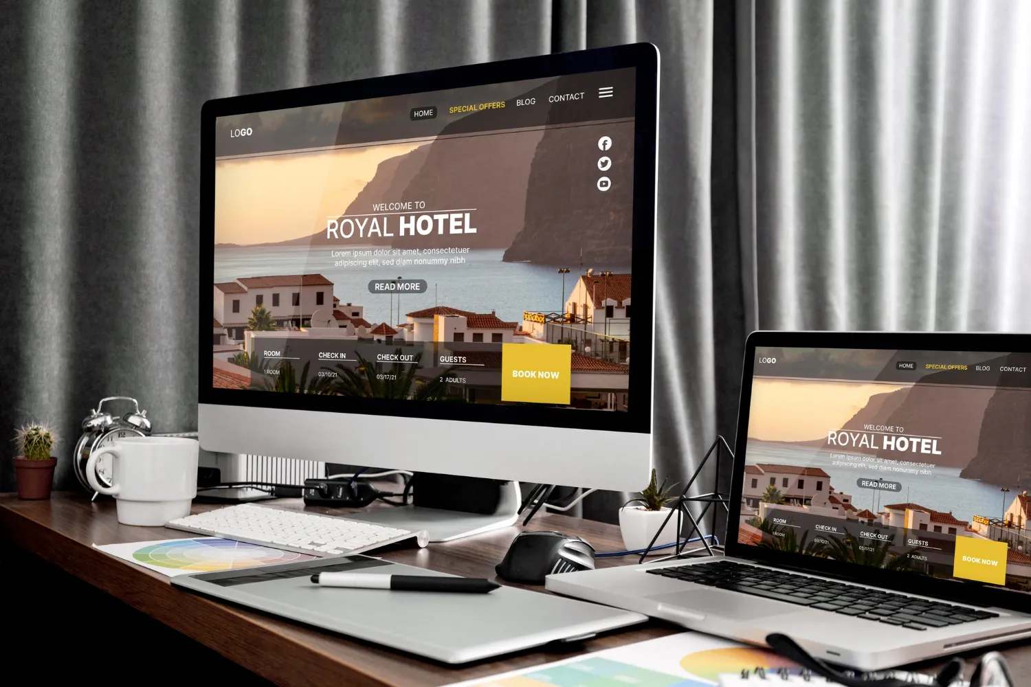
As the digital storefront of any brand, a homepage plays a critical role in shaping first impressions and driving conversions. That’s why understanding the principles behind the best homepage design is essential for businesses aiming to capture attention and guide visitors toward meaningful actions.
To engage audiences effectively, a successful homepage combines strategic layout, intuitive navigation, and a clear value proposition that resonates with its target users. Below, we’ve curated some of the best homepage designs to inspire your own projects and show how these elements come together in practice.
Key Takeaways:
The best homepage design functions as a brand’s front door, setting the tone for first impressions and encouraging user interaction across industries.
Strategic layout, intuitive navigation, and clear value propositions are essential for attracting and guiding visitors effectively.
Leading examples like Jeton, UNITED24, and Apple Siri showcase innovation through storytelling, interactivity, minimalism, and responsive design.
The Best Homepage Design Examples for Designers
One of the most effective ways to learn what makes a strong homepage is by studying real-world examples. Below are some standout designs you can draw inspiration from for your own projects.
As the first example of graphic design on the homepage of this article, Jeton revolutionizes digital finance through a sophisticated homepage that prioritizes security, user experience, and modern fintech design. Here, the strategic placement of transparent communication and professional aesthetics builds stability and credibility.
UNITED24’s homepage combines aesthetic appeal with data storytelling through interactive maps, bold typography, and strategic white space to inspire action. Mobile optimization, fast-loading interactive elements, and transparent progress indicators build trust while ensuring global accessibility and impactful nonprofit communication.
As a website builder, Osmo’s homepage stands out with its daring, futuristic design defined by sharp contrasts, intuitive layout, and bold yet highly readable typography. The platform successfully blends user-focused functionality with modern design values, making it both striking and practical.
Bruno Simon’s portfolio blends gaming elements with professional presentation, using 3D WebGL and car-based navigation to create memorable, interactive experiences. It balances creativity, accessibility, and technical excellence through physics-based interactions, optimized loading, and clear UI for smooth exploration.
Baseborn Studio’s website reflects the best homepage design practices by blending minimalism, strategic white space, and black-and-white aesthetics to enhance clarity, credibility, and visual impact. Clear navigation, professional typography, strong value propositions, and testimonials effectively communicate expertise and studio capabilities.
Apple Siri’s homepage uses a clean, straightforward design supported by clear typography and subtle animations that highlight key features while reinforcing the brand. A strong visual hierarchy and seamless mobile optimization ensure clarity, accessibility, and a consistent experience across all devices.
Phamily Pharma revolutionizes the pharmaceutical supply chain by bridging everyone involved through advanced technology, transparency, and user-focused design. Recognized among the best websites of 2025, it combines comprehensible contrasts, bold fonts, and easy-to-explore features to boost the users’ experience.
Lusion sets the standard for interactive web design by combining advanced technologies, sleek aesthetics, and responsive animations to create immersive experiences. Its homepage balances creative expression, client integration, and performance optimization to showcase agency expertise and support branding.
Superlist uses interactive workplace accessories, strategic white space, and visual storytelling to convey purpose, engage users, and simplify complex features effectively. Scrolling experiences and intuitive navigation guide visitors while maintaining focus on productivity and clear messaging.
Formless showcases the best homepage design by combining innovative layouts, engaging animations, and community-driven features. Its interactive elements balance creativity with functionality, building trust while reinforcing storytelling, accessibility, and a strong sense of ownership.
Grab & Go’s vibrant orange design, seamless image integration, and scroll animations create dynamic, appetizing experiences that enhance product discovery and navigation. Strategic categorization, mobile optimization, and engaging visuals ensure smooth ordering, clear value communication, and strong support for food service brand goals.
SPINX Digital’s homepage features bold design, vibrant green branding, and minimal navigation. Crisp text, cinematic visuals, and responsive layouts combine to showcase expertise and guide visitors seamlessly across devices.
George Nakashima Woodworkers’ homepage (Source: George Nakashima Woodworkers)
George Nakashima Woodworkers’ homepage blends elegant imagery, meaningful quotes, and sustainable themes to reflect artisan values. Thoughtful typography and authentic storytelling build emotional connections while supporting e-commerce and brand identity.
Critical Danger uses bold red typography, parallax scrolling, and motion effects to deliver urgent conservation stories. Its design makes complex issues accessible while encouraging education, action, and support.
The Hall of Zero Limits’ homepage (Source: The Hall of Zero Limits)
The Hall of Zero Limits delivers immersive 3D storytelling with interactive navigation, quizzes, and strategic branding, enhancing engagement and community connection. Multi-device optimization and seamless scrolling ensure accessible, visually striking experiences that support marketing goals across audiences.
As the article’s last best homepage design, Simply Chocolate uses minimal layouts, strong visuals, and mobile optimization to highlight product quality. Engaging photography and immersive design build trust and drive conversions.
Additional Tips for Designing the Best Homepage Design
To help you with designing the top homepage design for your projects, we also have some tips that can help you along the way:
Utilize a clean, visually balanced layout to create intuitive and engaging navigation.
Highlight key products or services with clear headlines and strong visuals.
Ensure fast loading speeds to reduce bounce rates and improve user experience.
Include clear calls-to-action (CTAs) that guide visitors toward desired actions.
Optimize for mobile devices to reach a wider audience effectively.
Maintain consistent branding elements to build trust and recognition.
Keep content concise, relevant, and easy to scan.
Improve Homepage Designs with Premium 3D Assets
Exploring the best homepage design examples reveals how strategic layouts, engaging visuals, and clear messaging can elevate user experience and drive conversions. To take your design even further, enhance it with premium 3D visual assets from Tridimensi and create a homepage that truly stands out and leaves a lasting impression!