SPECIAL OFFER ✦ BUY 2 GET 1 FREE! ✦ ADD 3 PRODUCTS TO YOUR CART, AND THE DISCOUNT APPLIES AUTOMATICALLY!
SPECIAL OFFER ✦ BUY 2 GET 1 FREE! ✦ ADD 3 PRODUCTS TO YOUR CART, AND THE DISCOUNT APPLIES AUTOMATICALLY!
SPECIAL OFFER ✦ BUY 2 GET 1 FREE! ✦ ADD 3 PRODUCTS TO YOUR CART, AND THE DISCOUNT APPLIES AUTOMATICALLY!
SPECIAL OFFER ✦ BUY 2 GET 1 FREE! ✦ ADD 3 PRODUCTS TO YOUR CART, AND THE DISCOUNT APPLIES AUTOMATICALLY!
Button UI UX might sound like a small detail, but it’s often the single element that decides whether a user completes an action or abandons it. A button that’s too small, unclear, or unresponsive breaks trust in seconds. This guide covers the states, sizing rules, and best practices teams rely on every day.
Key Takeaways:
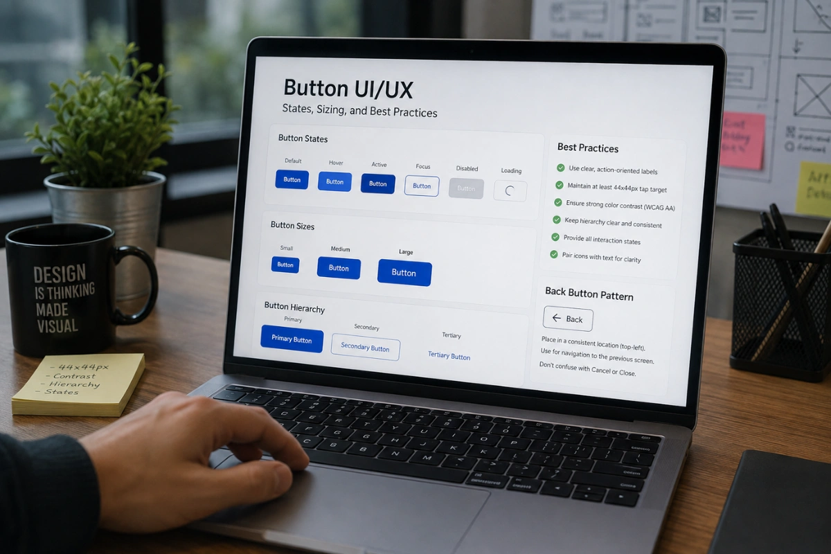
Every button needs at least four states (default, hover, active, and disabled) to feel responsive and trustworthy.
Button design best practices UI UX teams follow include a minimum 44x44px tap target and clear visual hierarchy between primary and secondary actions.
A back button UI UX pattern should always be predictable in placement so users never lose their sense of direction.
Why Button Design Deserves More Attention Than It Gets
Good UX UI buttons guide the user’s eye, confirm what will happen next, and reduce hesitation before a click
Buttons are the most-clicked element on almost any interface, yet they’re frequently treated as an afterthought once the rest of the layout is finished.
Good UX UI buttons guide the user’s eye, confirm what will happen next, and reduce hesitation before a click. Poorly designed ones, on the other hand, quietly increase drop-off rates without ever showing up as an obvious bug.
Part of the challenge is that buttons sit at the intersection of visual design and interaction design. A button can look beautiful in a static mockup and still fail in production if it doesn’t respond clearly to touch, hover, or keyboard input.
That’s why states, sizing, and consistency deserve as much attention as color and typography.
The Core Button States Every Designer Needs
A button isn’t a single static image; it’s a small system that reacts to user input.
A button isn’t a single static image; it’s a small system that reacts to user input. Skipping any of these states leaves users guessing whether their action registered at all, and that uncertainty is often enough to make them click twice or abandon the flow entirely.
Default: the resting state, styled to match its priority level in the interface.
Hover: a subtle shift in color, shadow, or scale that confirms the element is interactive.
Active/Pressed: a visible change the instant the button is clicked, giving immediate feedback.
Focus: a visible outline or ring for keyboard and screen-reader navigation.
Disabled: muted color and no pointer feedback, clearly signaling the action isn’t available yet.
Loading: a spinner or progress indicator for actions that take more than a second to process.
Sizing and Spacing Guidelines
Button design UI/UX decisions around size are rarely about aesthetics alone; they’re about physical usability.
Button design UI/UX decisions around size are rarely about aesthetics alone; they’re about physical usability. A button that looks fine on a large monitor can be nearly impossible to tap accurately on a phone, especially for users with larger fingers or limited fine motor control.
Keep tap targets at least 44x44px on mobile, following Apple and Google’s accessibility guidelines.
Leave at least 8px of spacing between adjacent buttons to prevent accidental taps.
Scale padding proportionally with font size so the button never feels cramped at larger text settings.
Avoid full-width buttons on desktop unless the layout genuinely calls for it, since oversized buttons can look like a lower-priority action.
Establishing Visual Hierarchy
Not every button on a screen carries equal weight, and the design should say so at a glance.
Not every button on a screen carries equal weight, and the design should say so at a glance. Mixing too many high-contrast buttons on one screen forces users to guess which action actually matters, which slows down decision-making instead of speeding it up.
Primary buttons use the boldest color and highest contrast for the one action you want users to take.
Secondary buttons use an outline or lighter fill for supporting actions.
Tertiary/text buttons stay minimal, usually just colored text, for the lowest-priority options like “Cancel.”
Button Design Best Practices UI UX Teams Should Follow
A handful of smaller decisions consistently separate polished interfaces from clumsy ones
Beyond states and sizing, a handful of smaller decisions consistently separate polished interfaces from clumsy ones. These are the details worth double-checking before a design ships, since they’re easy to overlook in a fast-moving sprint.
Use action-oriented labels like “Download Report” instead of vague ones like “Submit.”
Keep button copy short (ideally one to three words) so it stays legible on small screens.
Maintain consistent corner radius and shadow style across the entire product, not just one screen.
Always pair icons with text on primary actions; icon-only buttons should be reserved for well-recognized actions like search or close.
Test contrast ratios against WCAG AA standards so buttons remain readable for users with low vision.
If you’re preparing mockups or landing pages to showcase these button systems, polished visual backdrops make a real difference in how the presentation lands. Tridimensi offers curated 3D backgrounds and UI-ready assets that can dress up a design portfolio or client deck without extra production time.
The Back Button: A Special Case
Users rely on a back button to feel safe exploring an interface
A back button UI UX pattern deserves its own discussion because it behaves differently from every other button on the screen. Users rely on it to feel safe exploring an interface, knowing they can always retreat to familiar ground without losing progress they’ve already made.
Place the back button in a consistent, expected location, typically top-left on desktop and mobile.
Never disguise a “back” action as a “cancel” or “close” action; the two imply different outcomes.
On multi-step forms, keep the back button visually lighter than the “Next” or “Continue” button so users aren’t tempted to click the wrong one first.
On mobile, respect the native OS back gesture instead of fighting it with a custom implementation.
Common Mistakes That Undermine Good Button Design
Even experienced teams fall into a few recurring traps that quietly hurt conversion and usability.
Even experienced teams fall into a few recurring traps that quietly hurt conversion and usability. Catching these early saves a lot of rework later in the process, especially once a design has already moved into development.
Ambiguous states: a hover effect so subtle it goes unnoticed, leaving users unsure if the element is clickable.
Inconsistent styling: primary buttons that look different from screen to screen, breaking the user’s mental model.
Low contrast: text or icons that fail accessibility checks, especially on gradient or image backgrounds.
Overcrowded actions: three or more competing calls to action on one screen, diluting focus.
Best Practices for Designing Effective UI Buttons UX Design at Scale
A documented button library saves time and keeps every new feature visually consistent
Once a product grows beyond a handful of screens, best practices for designing effective UI buttons ux design teams tend to shift toward systems rather than one-off decisions.
A documented button library saves time and keeps every new feature visually consistent, even as different designers and engineers work on the product over time.
Build a component library in Figma (or your design tool of choice) with every state pre-defined.
Document sizing tokens (small, medium, large) so engineers don’t guess at pixel values.
Review button hierarchy during design critiques, not just after development is finished.
Revisit analytics periodically to see which button copy and placement actually drive the most clicks.
Final Thoughts
Button UI UX is one of those details that users never consciously notice when it’s done right, but they immediately feel when it’s done wrong. Clear states, sensible sizing, and a documented set of best practices turn a small UI element into a reliable driver of conversions.
If you’re building out design decks or landing pages to showcase this kind of work, explore Tridimensi’s Unlimited Access for unlimited downloads of premium 3D assets that make every presentation look production-ready.