SPECIAL OFFER ✦ BUY 2 GET 1 FREE! ✦ ADD 3 PRODUCTS TO YOUR CART, AND THE DISCOUNT APPLIES AUTOMATICALLY!
SPECIAL OFFER ✦ BUY 2 GET 1 FREE! ✦ ADD 3 PRODUCTS TO YOUR CART, AND THE DISCOUNT APPLIES AUTOMATICALLY!
SPECIAL OFFER ✦ BUY 2 GET 1 FREE! ✦ ADD 3 PRODUCTS TO YOUR CART, AND THE DISCOUNT APPLIES AUTOMATICALLY!
SPECIAL OFFER ✦ BUY 2 GET 1 FREE! ✦ ADD 3 PRODUCTS TO YOUR CART, AND THE DISCOUNT APPLIES AUTOMATICALLY!
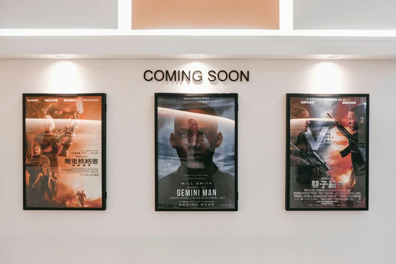
Film poster typography plays a crucial role in shaping how audiences perceive a movie before they even watch it. The right font can instantly communicate a film’s mood, genre, and personality while ensuring the title sticks in the audience’s mind.
From bold action lettering to elegant dramatic typefaces, every typography choice influences a poster’s visual identity. This guide explores how to choose the right movie poster fonts, understand different typography styles, and create designs that capture attention.
What Is Film Poster Typography and Why Is It Important?
Typography can create an emotional connection with audiences before they even know a film’s plot. (Photo by Mottss Designco on Unsplash)
Film poster typography is the art of selecting and arranging type to communicate a movie’s message while enhancing its visual identity. More than just text, typography helps tell a story by reflecting the film’s mood, genre, and personality.
The right typeface can create an emotional connection before audiences know the plot. For example, horror posters often use distressed lettering to build tension, while romantic dramas may use elegant fonts to create a warmer feel.
Movie poster typography also serves several important functions in poster design, such as:
Communicating the movie’s theme and tone.
Strengthening the film’s visual identity.
Improving readability and capturing attention.
Creating memorable branding that audiences can instantly recognize.
In other words, effective typography balances aesthetics with readability. Font style, size, spacing, and placement all work together to guide the viewer’s attention while reinforcing the story behind the poster.
Common Film Poster Typography Approaches
From minimalist title-only designs to oversized lettering, typography style can shape a poster’s entire visual identity. (Photo by Tyson Multrie on Unsplash)
Designers choose different film poster typefaces depending on the story they want to tell. These approaches show how cinematic typography design can turn simple lettering into a powerful storytelling element:
1. Typography Only
In this minimalist approach, the poster relies almost entirely on the movie title, with little or no imagery. This minimalist style lets the typography carry the entire visual message, making the title itself the focal point.
2. Image Within the Words
This technique uses large letterforms as frames that contain illustrations or scenes from the film. This combines typography and imagery into a single visual element while maintaining a clean composition.
3. Typography as Image
Some posters transform the letters themselves into recognizable objects or symbols related to the story. Instead of placing an illustration beside the title, the typeface becomes an integral part of the artwork.
4. Big Title Composition
This style emphasizes oversized typography that dominates the layout. The scale of the title immediately suggests that the film offers a grand, cinematic experience while drawing attention even from a distance.
Famous Film Poster Fonts and What Makes Them Iconic
Star Wars posters.
Some famous movie poster fonts have become just as recognizable as the films themselves. By matching the story, genre, and tone of each movie, these iconic typography choices help create memorable visual identities.
Let’s look at some memorable examples:
The Star Wars logo features a bold, sans-serif typeface that immediately communicates adventure and epic scale. Its distinctive lettering has remained recognizable for decades and is closely tied to the franchise’s identity.
Jurassic Park uses a custom, stencil-inspired type treatment that reinforces themes of prehistoric power and exploration. Combined with its iconic silhouette logo, the typography has become one of cinema’s most recognizable title designs.
Harry Potter employs a custom serif-inspired logo with its famous lightning-bolt detail, instantly establishing the magical atmosphere of the Wizarding World.
Barbie takes the opposite approach with a playful script logo that reflects the brand’s cheerful and energetic personality. The typography alone is enough to make the poster instantly identifiable.
Psycho uses condensed lettering with sharp breaks that resemble knife slashes, visually reinforcing the psychological tension and unsettling mood of the classic film.
Titanic relies on the classic Trajan-style serif, creating a timeless and elegant appearance that complements the film’s epic historical romance.
How to Choose Film Poster Fonts for Different Genres
Matching typography to genre — bold for action, elegant serifs for drama, distressed lettering for horror — helps a poster instantly signal its mood. (Photo by Pressfoto on Magnific)
Choosing the right movie poster fonts starts with understanding the emotions each genre should communicate. The right typeface should support the story rather than compete with it.
Here’s how typography choices vary across different genres:
Horror: Designers often use distressed serif fonts, hand-drawn lettering, or jagged edges that create discomfort and suspense.
Action: Movies typically benefit from bold sans-serif or slab-serif fonts with strong, condensed shapes that suggest power, movement, and intensity.
Drama: Elegant serif fonts or clean, modern sans-serifs communicate sophistication while allowing emotional storytelling to take center stage.
Sci-Fi and Fantasy: Posters frequently feature geometric, futuristic, or custom-designed typefaces that help build immersive fictional worlds and unique visual identities.
Comedy: Films often use approachable sans-serif or playful script fonts that immediately create a lighthearted and welcoming impression.
Regardless of the genre, typography should always prioritize readability. Test your design at thumbnail size, maintain a clear visual hierarchy, and avoid using too many fonts. Small adjustments to spacing and letterforms can help create a more distinctive look while keeping the design easy to read.
Conclusion
Great film poster typography goes beyond choosing an attractive font. The right typography communicates a film’s personality, strengthens its visual identity, and creates a memorable first impression.
By understanding different styles and matching fonts to each genre, designers can create posters that are memorable and effective.
For more creative possibilities, Tridimensi’s premium 3D assets can bring depth and fresh inspiration to your next design project. Explore the collection and discover new ways to bring your visual ideas to life.