SPECIAL OFFER ✦ BUY 2 GET 1 FREE! ✦ ADD 3 PRODUCTS TO YOUR CART, AND THE DISCOUNT APPLIES AUTOMATICALLY!
SPECIAL OFFER ✦ BUY 2 GET 1 FREE! ✦ ADD 3 PRODUCTS TO YOUR CART, AND THE DISCOUNT APPLIES AUTOMATICALLY!
SPECIAL OFFER ✦ BUY 2 GET 1 FREE! ✦ ADD 3 PRODUCTS TO YOUR CART, AND THE DISCOUNT APPLIES AUTOMATICALLY!
SPECIAL OFFER ✦ BUY 2 GET 1 FREE! ✦ ADD 3 PRODUCTS TO YOUR CART, AND THE DISCOUNT APPLIES AUTOMATICALLY!
When you open a magazine, browse a website, or scroll through an app, you’re seeing the power of structure at work. With grid systems in graphic design, every element feels intentional, creating harmony that makes content both engaging and readable. Want to know more about this grid system? Read the article below.
Key Takeaways:
Grid systems provide a structural framework that helps designers organize text, images, and graphics with clarity and consistency.
Grids bring balance to compositions, preventing clutter and easy to navigate.
From print to digital platforms, grid systems improve usability and readability while supporting creative expression.
Understanding Grid Systems in Graphic Design
So, what are grid systems? At its core, a grid system is a framework built from intersecting horizontal and vertical lines. This structure divides a layout into sections like columns, rows, gutters (the spaces in between), and margins. These divisions act as invisible guides that help designers arrange text, images, and other visual elements.
The main role of a grid is to bring order and clarity to a design. With the framework clearly visualized, every element has its place, making them harmonious and easy for the viewer to follow. Instead of relying only on perfect symmetry, grids offer balance through structure and alignment.
On a practical level, they also make the design process more efficient. Having a predefined structure means less guesswork and more focus on creativity. It’s a tool that supports both beginners and experienced designers in producing polished, professional results.
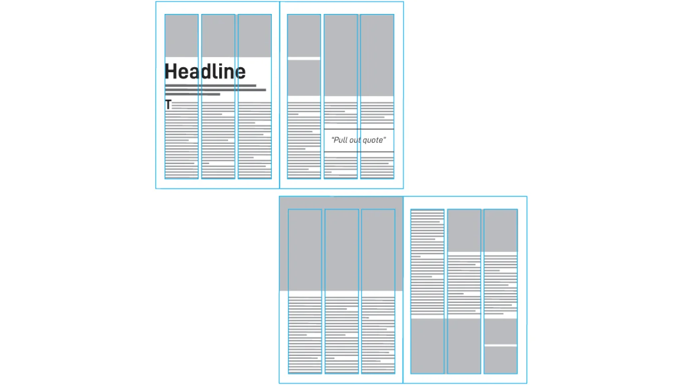
What Is a Grid System in Design?
In graphic design, a grid system became a tool that organizes content into a clear, structured layout. Dividing a page or screen into rows and columns guides where elements should sit in relation to each other. The result is a design that feels balanced, easy to read, and visually consistent.
A grid typically includes four main parts:
Columns – vertical divisions for placing content
Rows – horizontal divisions across the layout
Gutters – the spacing between columns or rows
Margins – the outer edges that frame the design
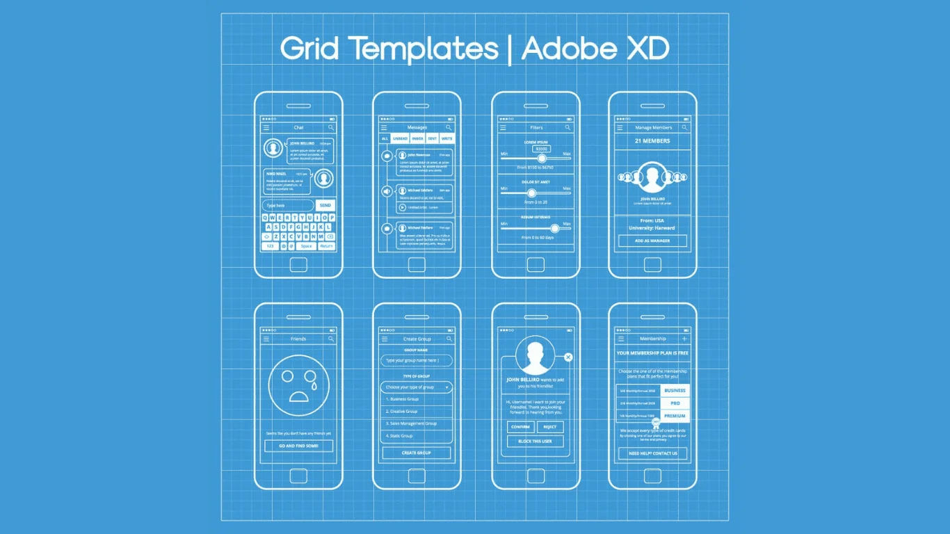
Grids show up almost everywhere, from web design and digital interfaces to print layouts and typography. They became especially influential in the 20th century through Swiss graphic design, where clarity and order were highly valued.
What makes grids so useful is their ability to align content without forcing everything to end at the same point. As long as elements begin along the same grid line, the layout maintains consistency while still leaving room for creative flexibility.
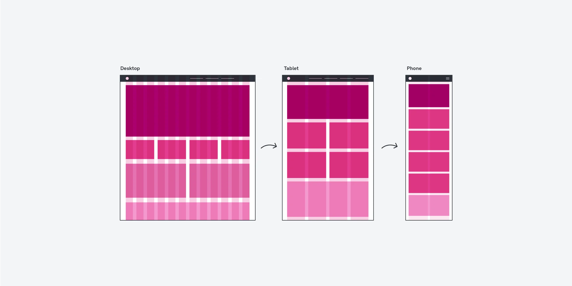
How Grid Systems Shape Design Across Print and Digital
More than simply organizing content, grid systems also shape how information is perceived and experienced. By influencing hierarchy, balance, and adaptability, they act as a foundation for effective design across both print and digital platforms.
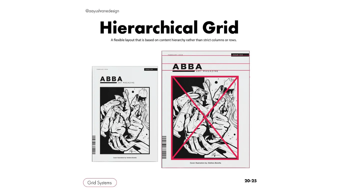
Building Hierarchy
One of the biggest strengths of grid systems is their ability to establish visual hierarchy. By controlling where elements sit and how much space they occupy, grids naturally guide the viewer’s eye.
Hierarchical grids, for example, make it easy to highlight the most important information first, then direct to supporting details. Adjustments in column width, row height, spacing, and placement all help ensure that key content stands out while secondary elements stay organized.
Balancing Compositions
Grids also bring balance to a design. By aligning elements along vertical and horizontal lines, they create order without forcing rigid symmetry. This structure prevents layouts from feeling cluttered or uneven, instead giving a sense of stability and flow. The result is a design that feels intentional, pleasing to look at, and easier for users to navigate.
Implementing Grid Systems
When applying grids, it’s important to consider both the medium and the project’s goals. Here are some strategies to keep in mind:
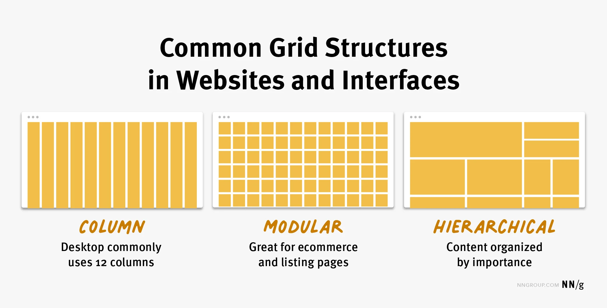
Choose the right grid type, like manuscript, column, modular, baseline, or hierarchical, based on the project’s complexity.
Define columns and gutters that match the scale of your content and the size of the page or screen.
Use margins to frame content and keep layouts from feeling overcrowded.
Align elements consistently with grid lines to maintain order while still leaving room for creative choices.
In print design, grids are especially useful for multi-page projects like books or magazines, where consistency in page numbers, headers, and content flow matters. In digital design, responsive grids adapt layouts across devices, ensuring readability whether viewed on a phone, tablet, or desktop.
Unlocking Potential with Grid Systems in Graphic Design
Designers often return to grids because they provide balance and clarity while encouraging creativity. By using them effectively, projects feel unified and user-friendly. Ultimately, grids remain a timeless method for turning scattered elements into designs with purpose and impact.
So, if you’re on the journey to create your own balanced and proportionate graphic designs, you can visit Tridimensi for inspiration. By grabbing the high-quality assets, animations, and backgrounds, you can further develop your creativity to match the industry standard.