SPECIAL OFFER ✦ BUY 2 GET 1 FREE! ✦ ADD 3 PRODUCTS TO YOUR CART, AND THE DISCOUNT APPLIES AUTOMATICALLY!
SPECIAL OFFER ✦ BUY 2 GET 1 FREE! ✦ ADD 3 PRODUCTS TO YOUR CART, AND THE DISCOUNT APPLIES AUTOMATICALLY!
SPECIAL OFFER ✦ BUY 2 GET 1 FREE! ✦ ADD 3 PRODUCTS TO YOUR CART, AND THE DISCOUNT APPLIES AUTOMATICALLY!
SPECIAL OFFER ✦ BUY 2 GET 1 FREE! ✦ ADD 3 PRODUCTS TO YOUR CART, AND THE DISCOUNT APPLIES AUTOMATICALLY!
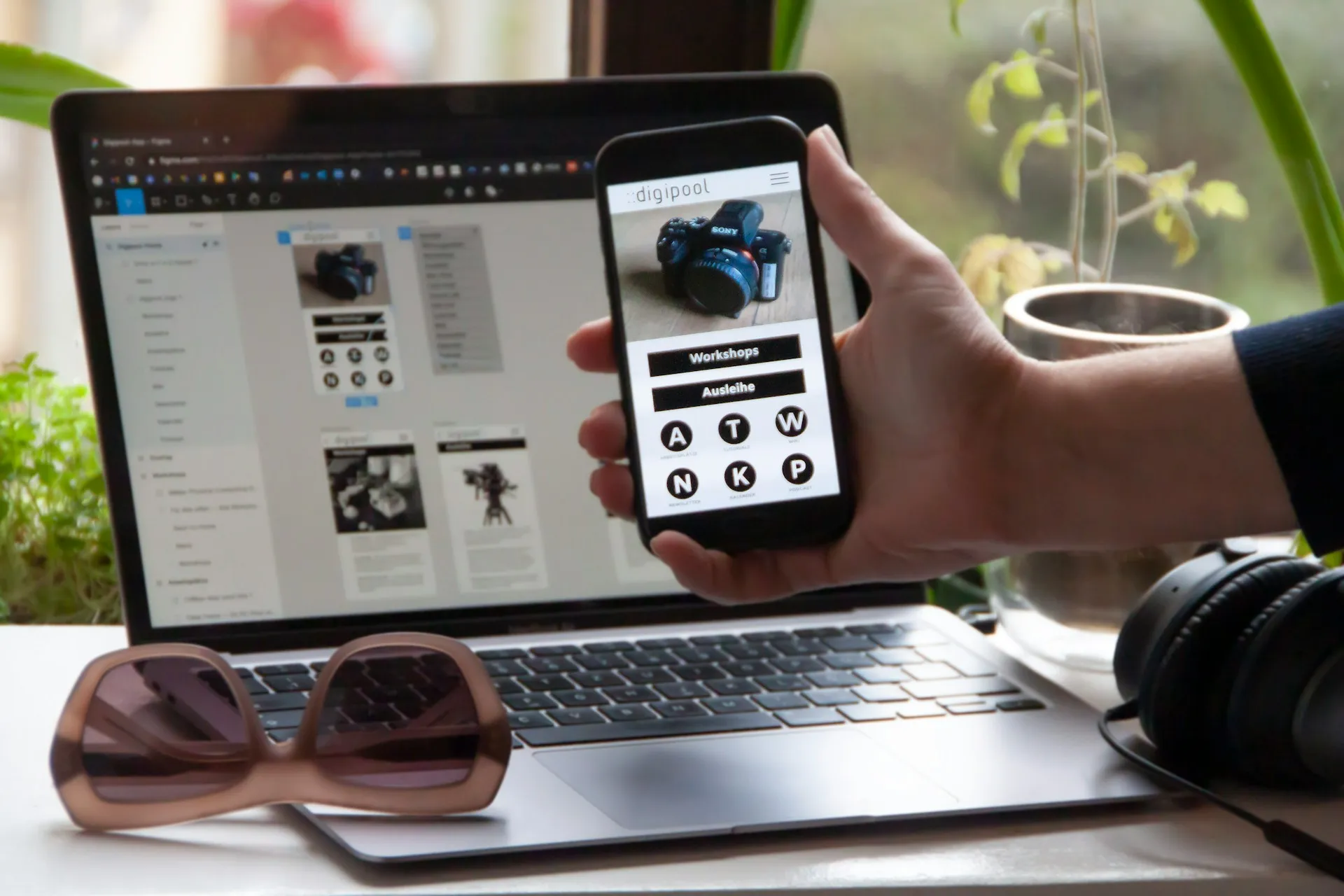
Ever opened a website that looked perfect on your laptop but messy on your phone? That’s where adaptive web design comes in. With this design principle, brands can deliver smoother, faster experiences that feel natural on every device.
Key takeaways:
Adaptive websites deliver device-specific layouts for a smoother, more consistent browsing experience.
Many top brands, from Amazon to Apple, successfully use adaptive design to serve their diverse audiences.
Combining adaptive and responsive methods can create the most effective modern web experiences.
What is Adaptive Web Design?
Adaptive Web Design (AWD) is a strategy where multiple fixed layouts of a website are created for different screen sizes. Instead of one flexible layout that adjusts fluidly, adaptive design detects the user’s device and loads a version specifically designed for it, giving desktop, tablet, and mobile users an optimized experience.
Each layout is built for key breakpoints, chosen through server or client logic. This approach focuses on improving readability, navigation, and performance by tailoring every element to fit its device perfectly.
Unlike responsive design, which continuously scales, adaptive web design switches between predefined layouts. Many modern sites even combine both methods for wider compatibility. This approach is big in its precision, allowing designers to fine-tune interfaces, enhance performance, and deliver smoother usability across devices.
Like any design approach, adaptive web design has its strengths and challenges. It gives designers precise control over how a site looks on different devices, creating smoother and more personalized user experiences. However, managing multiple versions can take more time, cost, and effort.
Below are the main advantages and disadvantages to consider before choosing this method.
Advantages of Adaptive Web Design
Tailored user experience: Each device gets a layout designed specifically for its screen size, making browsing smoother and more intuitive.
Faster loading speeds: Only device-specific layouts and assets are loaded, improving overall performance, especially on mobile.
Greater design control: Designers can fine-tune each version for pixel-perfect alignment and consistent user interface quality.
Efficient maintenance: Existing components can be reused across versions, allowing updates without rebuilding the entire website.
Better ad placement: Ads and banners can be precisely adjusted per device, eliminating awkward scaling or layout breaks.
Disadvantages of Adaptive Web Design
Higher development costs: Building and maintaining multiple versions requires more time, resources, and testing.
Complex content management: Updating designs or text must be done across several versions, which can be labor-intensive.
Limited flexibility: New screen sizes or devices may need additional layouts to stay fully compatible.
Longer production time: Designing and testing multiple layouts naturally extends development timelines.
Possible user inconsistencies: If the detection system misfires, users might see the wrong layout or experience performance issues.
Many global brands use adaptive web design to deliver consistent experiences across devices. From e-commerce giants to airlines, these examples show how adaptive layouts enhance usability, speed, and visual performance for diverse audiences.
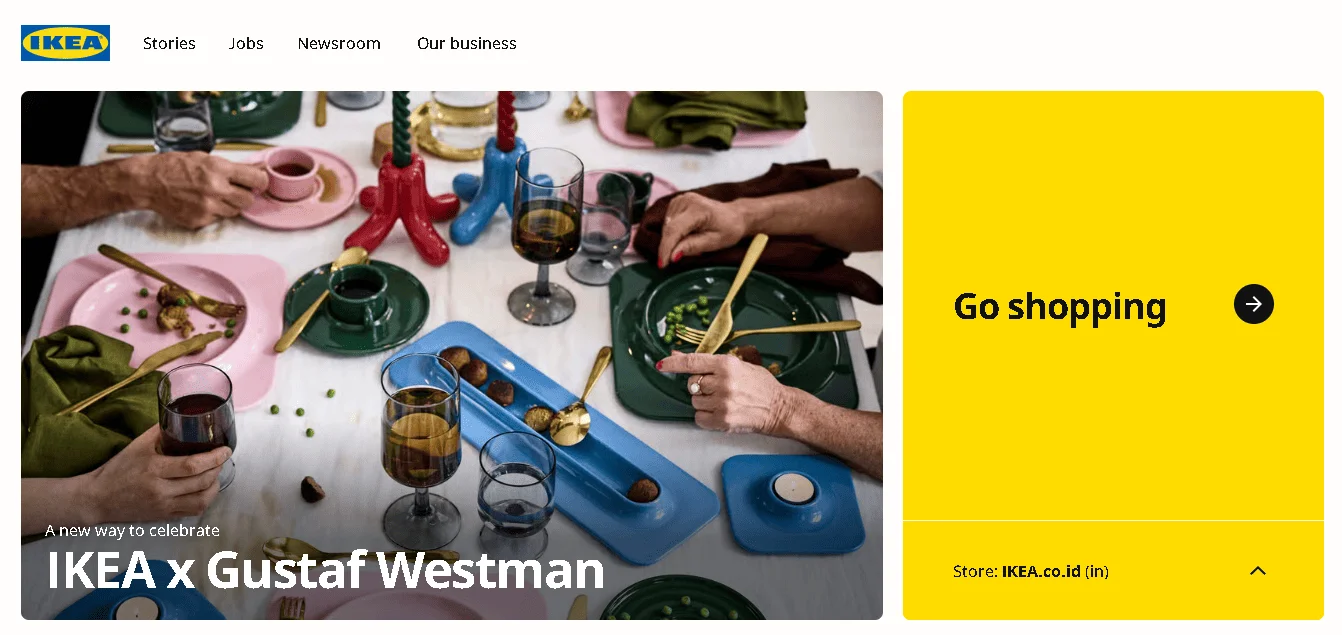
1. IKEA
IKEA adaptive design (Source: IKEA)
IKEA’s adaptive interface highlights its micro interaction design, where small animations and responsive touches enrich browsing, helping customers feel immediate feedback as they search or add items to their cart.
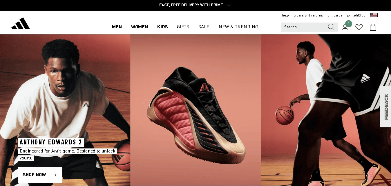
2. Adidas
Sporty and Adaptive Adidas Web (Source: Adidas)
The brand blends adaptive logic with mobile-first and responsive design, making shopping seamless across smartphones, tablets, and desktops while keeping its identity consistent.
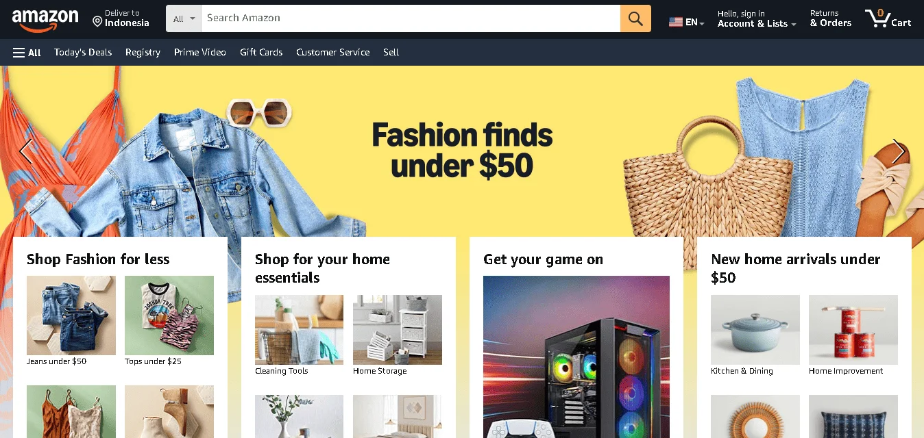
3. Amazon
Amazon’s Easy Navigation Website (Source: Amazon)
Amazon combines adaptive and reactive web design to load different layouts and dynamically adjust key interface components, ensuring faster navigation and smoother interactions across all screen types.
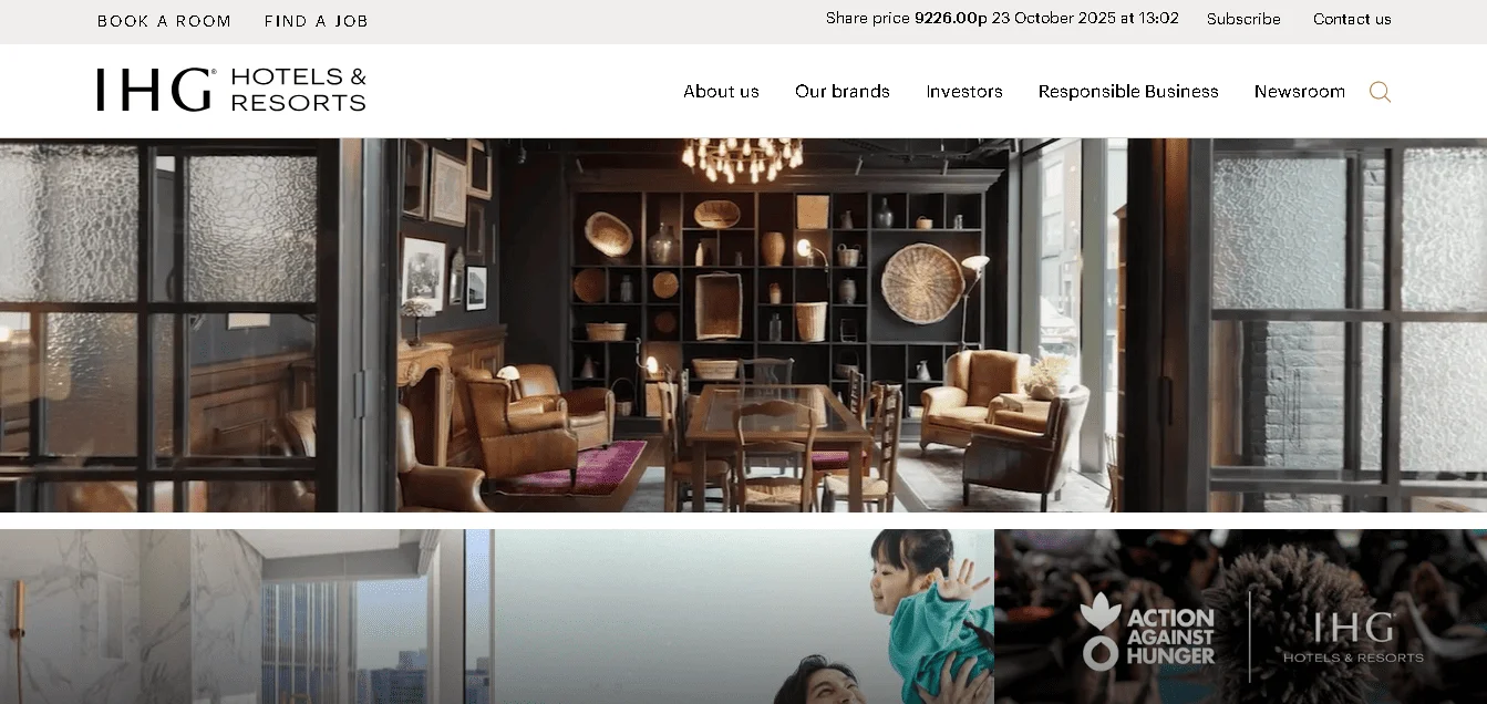
4. IHG (InterContinental Hotels Group)
Mobile Adapted Website (Source: InterContinental Hotels Group PLC)
IHG’s adaptive web design provides mobile travelers with a version that emphasizes quick hotel booking, location services, and current offers. Meanwhile, desktop visitors get a fuller layout with expanded search and content.
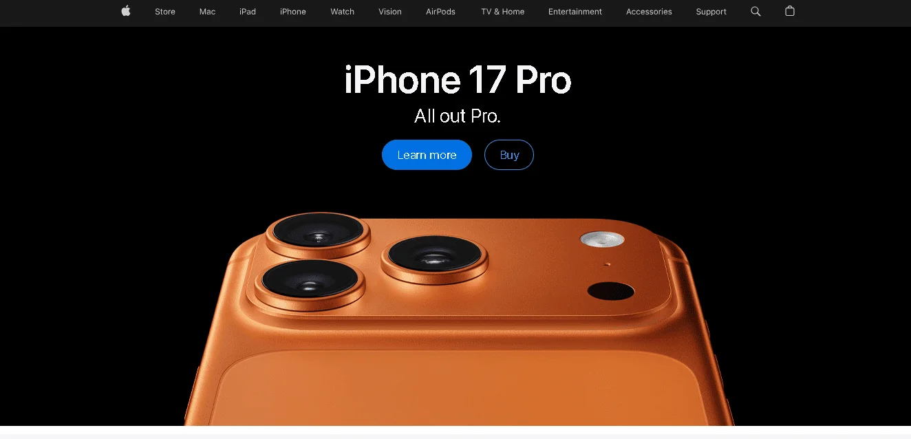
5. Apple
Simple and Adaptive Website (Source: Apple)
Apple’s site reflects its signature bold minimalism design, where adaptive layouts prioritize clean visuals, simple navigation, and large imagery for impactful storytelling across devices.
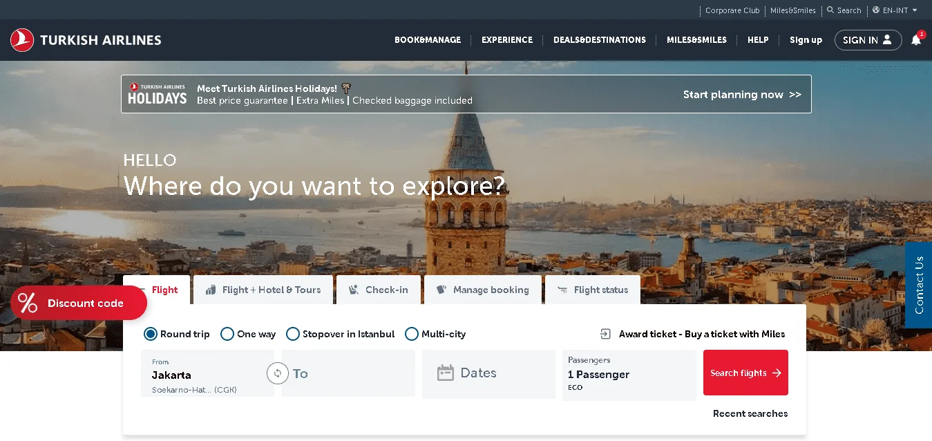
6. Turkish Airlines
Turkish Airlines Dynamic Web Design (Source: Turkish Airlines)
The airline uses three layout versions: a desktop site, a mobile web layout, and a mobile app. It dynamically serves the version best suited to each user’s device, giving mobile users streamlined access to booking and flight status information.
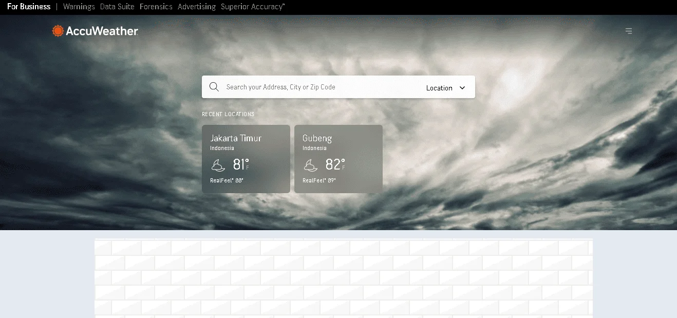
Mobile Adaptive Weather Forecast (Source: AccuWeather)
AccuWeather delivers a tailored mobile version with graphics scaled for slower connections, GPS-based “use current location” features, and a simplified layout compared to the desktop version.
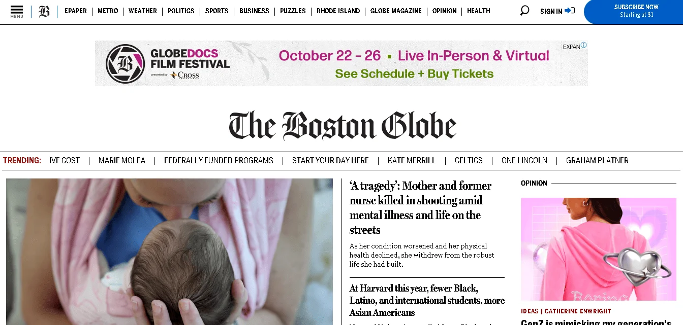
8. The Boston Globe
Adaptive News Website (Source: The Boston Globe)
As a media site, The Boston Globe uses adaptive design to present readers with a version optimized for mobile (touch-friendly, leaner content) and a richer layout for desktop reading.
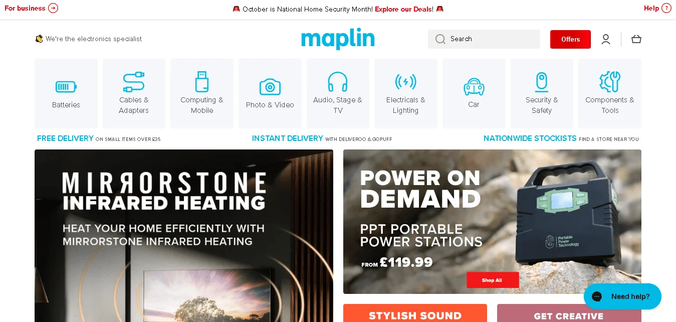
9. Maplin
Adaptive Electronics Website (Source: Maplin)
The UK electronics retailer opted against a separate mobile URL and chose an adaptive model: its mobile site uses lighter page weight and an interface tailored for product browsing and purchasing on smaller screens.
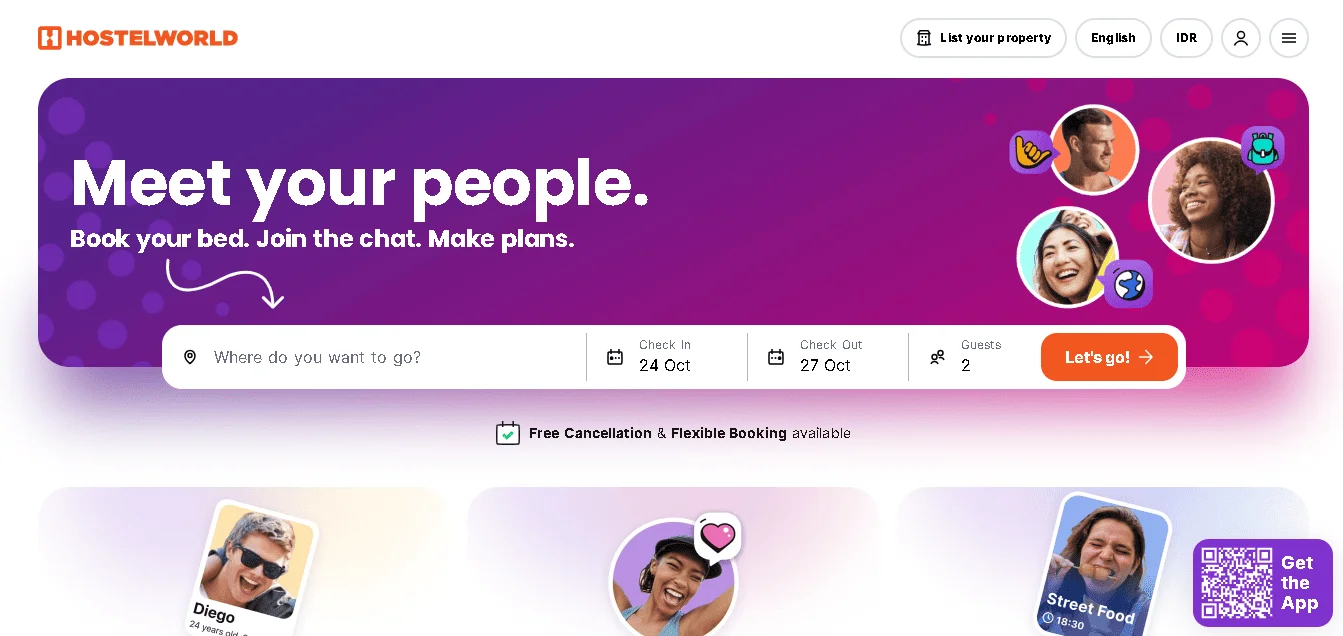
HostelWorld’s mobile experience features an adapted version focusing on search and booking flows for travelers on the go, while the desktop site supports richer content exploration and planning.
Every scroll, click, and interaction can feel more natural when design adapts to the user, not the other way around. Now that you understand how it works, you’re ready to create experiences that truly make sense.
To take your design further, tridimensi brings adaptability to life through clean, purposeful elements. We craft digital experiences that look stunning, feel intuitive, and adapt naturally, no matter where your audience meets your brand. Discover how we can elevate your next project. Visit us today and see the difference.