SPECIAL OFFER ✦ BUY 2 GET 1 FREE! ✦ ADD 3 PRODUCTS TO YOUR CART, AND THE DISCOUNT APPLIES AUTOMATICALLY!
SPECIAL OFFER ✦ BUY 2 GET 1 FREE! ✦ ADD 3 PRODUCTS TO YOUR CART, AND THE DISCOUNT APPLIES AUTOMATICALLY!
SPECIAL OFFER ✦ BUY 2 GET 1 FREE! ✦ ADD 3 PRODUCTS TO YOUR CART, AND THE DISCOUNT APPLIES AUTOMATICALLY!
SPECIAL OFFER ✦ BUY 2 GET 1 FREE! ✦ ADD 3 PRODUCTS TO YOUR CART, AND THE DISCOUNT APPLIES AUTOMATICALLY!
Websites today aim to feel alive, adapting, responding, and engaging instantly. That’s where reactive web design comes in, turning static pages into fluid experiences. Ready to see how it transforms the digital world?
Key Takeaways:
Building a reactive website involves careful planning, flexible layouts, CSS media queries, and continuous testing.
Core elements like fluid grids, flexible images, and videos ensure consistent performance across all devices.
Top platforms like Netflix, Spotify, and Facebook demonstrate how reactive web design enhances engagement and personalization.
Exploring the Power and Potential of Reactive Web Design
A reactive website delivers a seamless experience across all platforms and devices. Before exploring how to implement it, it’s important to first understand what it is and the key benefits it offers.
What is Reactive Web Design?
Reactive web design is a modern approach to building websites that adapt in real time to user actions, device types, and surrounding conditions. Unlike traditional responsive design (which mainly adjusts the layout according to screen size), reactive design instantly responds to interactions such as clicking, scrolling, or switching devices.
This adaptability is powered by live data integration, smart content loading, and dynamic updates that occur without reloading the entire page. Developers often use frameworks like React.js, Angular, or Vue.js to bring this level of interactivity to life.
Advantages of Reactive Web Design
The benefits of reactive web design go far beyond aesthetics. This approach creates a more intelligent and responsive environment that anticipates user needs and adjusts content in real time. Here’s why it’s essential for modern websites:
Enhanced User Engagement: Instant feedback and adaptive content encourage users to stay longer and interact more.
Improved Efficiency: Only the necessary elements reload, saving bandwidth and improving site speed.
Scalability: New features can be added easily without hurting performance.
Personalized Experiences: Content automatically adapts based on location, user preferences, or device type.
Better Handling of Slow Networks: Techniques like skeleton screens keep users engaged even during loading times.
In short, reactive website designs empower businesses to meet today’s demand for fast, intuitive, and personalized digital experiences. Ultimately, driving engagement, conversions, and even better SEO performance.
Aside from good visuals, creating a site that feels alive and intuitive requires thoughtful planning and technical precision. Below, we’ll look at the essential stages and elements that make reactive websites perform seamlessly.
Design Stages
Here are the essential steps of how reactive websites are designed:
Planning and User Behavior Mapping: Start by understanding your target users and how they interact across various devices. This insight forms the foundation for a truly adaptive web design.
Choose Frameworks and Tools: Opt for modern frameworks like React.js, Vue.js, or Angular to enable instant, dynamic updates and efficient data handling.
Implement a Fluid Grid System: Use proportional grids that automatically resize content, keeping layouts balanced on every screen.
Apply CSS Media Queries: Define breakpoints to tailor visual styles according to device width, resolution, or orientation.
Create Flexible Images and Media: Apply CSS techniques that allow images and videos to scale fluidly without distortion.
Optimize Performance: Utilize asset preloading, skeleton screens, and smart caching to minimize load times.
Test and Iterate: Continuously test your design across devices, browsers, and network conditions, refining it for smoother performance.
Important Elements
To make a website truly reactive, every element must work in harmony. The following components define how your design adapts, loads, and responds smoothly across devices and user actions.
1. Fluid Grid System
A fluid grid uses relative units instead of fixed pixels, letting layouts resize proportionally across devices. It keeps content balanced and consistent, preventing horizontal scrolling and layout distortion
2. CSS Media Queries
Media queries apply tailored styling based on screen size, resolution, or orientation. They ensure every device receives optimized layouts, improving both usability and overall viewing experience.
3. Flexible Images
Flexible images use CSS properties like max-width: 100% to scale fluidly within containers. With the <picture> element, sites deliver sharper, device-specific visuals without overflow or pixelation.
4. Flexible Videos
Responsive videos automatically resize within containers while preserving aspect ratios. These adjustments prevent layout shifts and maintain smooth playback across all screen sizes and devices.
Here are some of the most notable examples of reactive websites, showing how top digital platforms use it to create seamless, dynamic user experiences.
1. Netflix
Netflix Logo on TV (Source: Unsplash)
Netflix uses React.js to deliver dynamic movie carousels and playback controls that update without page reloads. Its grid layouts and media queries ensure fluid, device-optimized streaming.
2. Spotify
Spotify Interface (Source: Unsplash)
Spotify’s web player updates playlists and recommendations instantly based on user activity. Its reactive interface adjusts to song actions, ensuring smooth transitions and real-time personalization.
3. Facebook
Facebook Mobile Interface (Source: Unsplash)
Facebook applies reactive design to load posts, comments, and notifications live. It updates in real time, keeping content fresh and engagement continuous across all devices.
4. Figma
Figma Tool (Source: Unsplash)
Figma’s browser-based design tool supports instant collaboration through reactive syncing. Edits appear live for all users, while layouts adapt responsively to screen size and artboard changes.
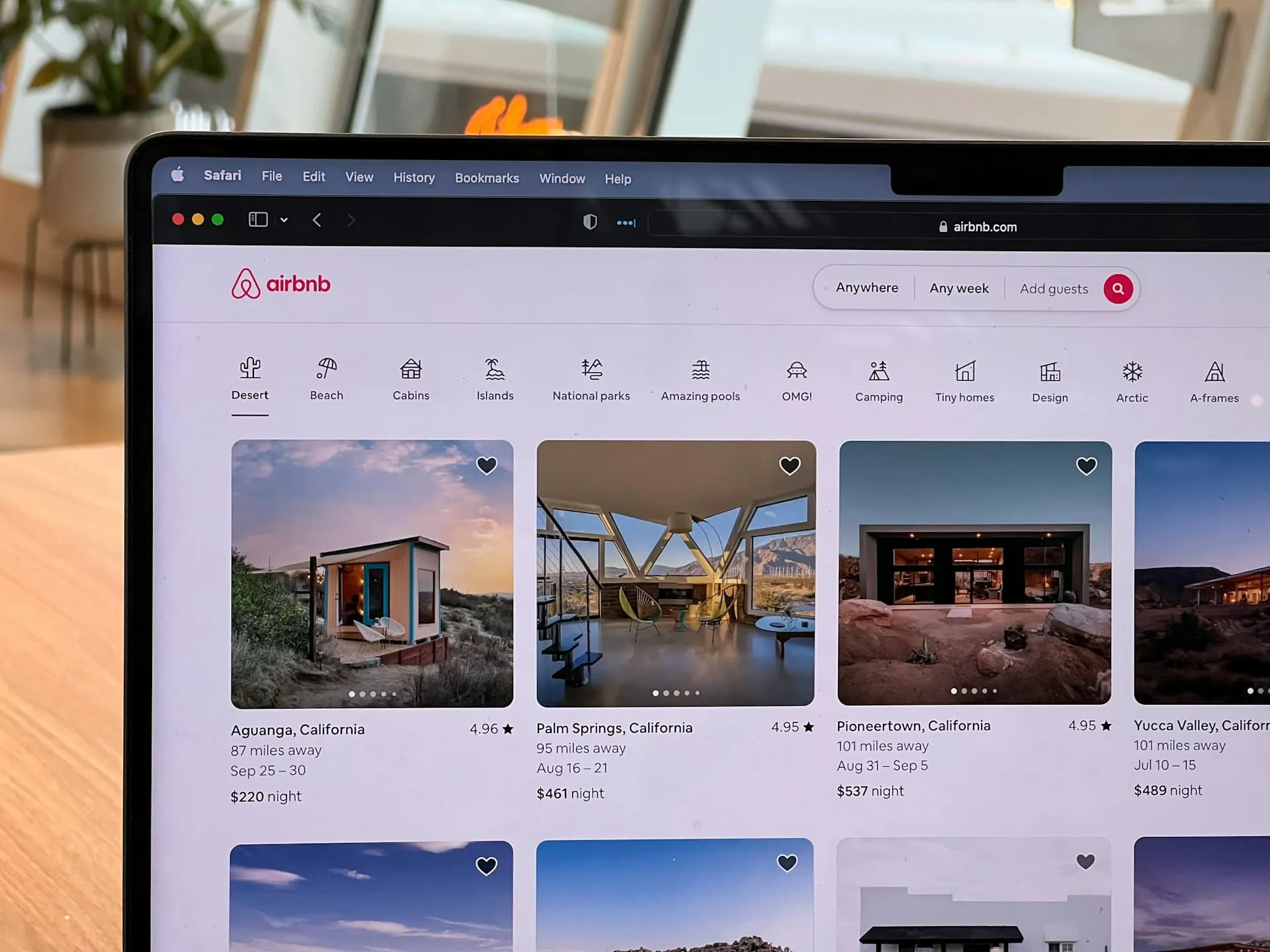
Airbnb’s site uses React and Tailwind CSS to adjust layouts fluidly. Its reactive search filters and bold, minimal design enhance the browsing and booking experience across all devices.
How Will You Shape the World of Reactive Web Design?
True digital innovation begins when design meets adaptability. By embracing real-time micro interaction designs and flexibility, creators can craft experiences that not only attract users but also evolve with their needs and expectations.
Think of Tridimensi as your guide into the responsive web’s new frontier. We’re here to help you take the ideas discussed above and turn them into a site that truly responds and delights. Simply grab our exceptional elements and watch your websites grow!