SPECIAL OFFER ✦ BUY 2 GET 1 FREE! ✦ ADD 3 PRODUCTS TO YOUR CART, AND THE DISCOUNT APPLIES AUTOMATICALLY!
SPECIAL OFFER ✦ BUY 2 GET 1 FREE! ✦ ADD 3 PRODUCTS TO YOUR CART, AND THE DISCOUNT APPLIES AUTOMATICALLY!
SPECIAL OFFER ✦ BUY 2 GET 1 FREE! ✦ ADD 3 PRODUCTS TO YOUR CART, AND THE DISCOUNT APPLIES AUTOMATICALLY!
SPECIAL OFFER ✦ BUY 2 GET 1 FREE! ✦ ADD 3 PRODUCTS TO YOUR CART, AND THE DISCOUNT APPLIES AUTOMATICALLY!
As mobile usage continues to rise, choosing between mobile first vs responsive design has become one of the most important decisions in building flexible, user-centered websites. Let’s take a closer look at how each approach works and discover which one best fits your project.
Key Takeaways:
Mobile first starts with small screens, focusing on speed and essentials. Meanwhile, responsive design adapts layouts to fit any device.
Mobile first boosts performance but may limit desktop depth. In contrast, responsive design keeps consistency but adds complexity.
Use mobile first for mobile-heavy audiences; choose responsive design for multi-device experiences.
Definitions of Mobile First and Responsive Designs
Before comparing mobile first vs responsive design, it’s important to understand what each approach means in practice.
Mobile-First Design
So, what is mobile first design? It’s an approach that begins with designing for the smallest screens first. By focusing on mobile layouts and core functionality, designers ensure that essential content works smoothly on smartphones before scaling up to larger devices.
This method promotes faster performance, cleaner code, and better accessibility on limited networks. It also prioritizes clarity, speed, and effortless interaction, key factors for an optimal mobile experience.
Responsive Design
Now, what is responsive design? Unlike mobile-first, this approach focuses on flexibility, ensuring websites automatically adapt across all devices. It shares similarities with adaptive web design, but instead of relying on predefined layouts, it uses CSS media queries, fluid grids, and scalable images to adjust to any screen size.
With a single HTML structure, content and elements resize seamlessly, maintaining visual consistency and usability without needing separate versions for each device.
Key Difference Between Mobile First Design and Responsive Design
While both approaches aim to deliver great user experiences, they differ in strategy and execution. These differences can strongly influence a web designer’s decision.
Starting Points
The mobile-first approach begins at the lower bound of screen dimensions and progressively enhances layouts for larger viewports.
Meanwhile, responsive design generally starts with a full-featured experience and gracefully scales it down for smaller screens.
Focus
Mobile-first reinforces a content-first mentality by demanding early decisions about what truly matters on the smallest devices.
On the other hand, responsive design prioritizes technical adaptability that preserves comprehensive features regardless of device size.
Technical Aspects
Mobile-first tends to yield leaner code bundles and faster initial load times on cellular networks through deliberate omissions of non-essential assets.
In comparison, responsive design focuses on maintaining uniformity in functionality and appearance at every breakpoint, which can accidentally cause complexity in stylesheet management and runtime adjustments.
Pros and Cons of Mobile First vs Responsive Design
Understanding the benefits of mobile first design and responsive design, along with their drawbacks, helps you choose the right approach for your project. Here are some key points to consider.
Mobile-First Design
Mobile-first design delivers faster performance on limited networks, focuses development on key features, and improves usability for mobile users who expect smooth, efficient experiences. By prioritizing essential content, it reduces cognitive load and creates clear information hierarchies that enhance engagement.
However, converting desktop-heavy sites into a mobile-first model can be challenging, especially with complex layouts or media-rich elements. Early exclusion of non-essential assets may also limit visual depth, so careful planning is needed to ensure desktop versions stay appealing and functional.
Responsive Design
Responsive design uses a single codebase, which simplifies maintenance and removes the need for separate mobile or desktop versions. It ensures consistent features and experiences across all devices, maintaining visual and functional harmony.
On the downside, responsive design can add front-end complexity due to advanced CSS rules and dynamic adjustments. This can sometimes affect performance or cause layout inconsistencies between breakpoints.
When deciding between mobile first vs responsive design, choose mobile first if your audience mainly uses smartphones or if your site must perform well under limited networks and device constraints.
Meanwhile, opt for responsive design when desktop experiences are equally important, consistent content across devices supports conversions, and flexibility is needed to maintain a cohesive look on all screens.
A hybrid approach can also be effective. Start with a mobile-first framework and let your design respond fluidly at defined breakpoints for the best of both worlds.
6 Real-World Implementation Examples
To better understand mobile first vs responsive design, let’s explore how global brands apply each approach to their homepages.
1. Spotify (Mobile-First)
Spotify’s interface (Source: Spotify)
Spotify’s mobile interface launches song previews and playlists instantly to defer non-essential components until network conditions stabilize.
2. Starbucks (Mobile-First)
Starbucks’ app interface (Source: The Manifest)
Starbucks redesigned its store locator using a mobile-first foundation, presenting map views and nearest outlet selections immediately and postponing promotional overlays until after location detection.
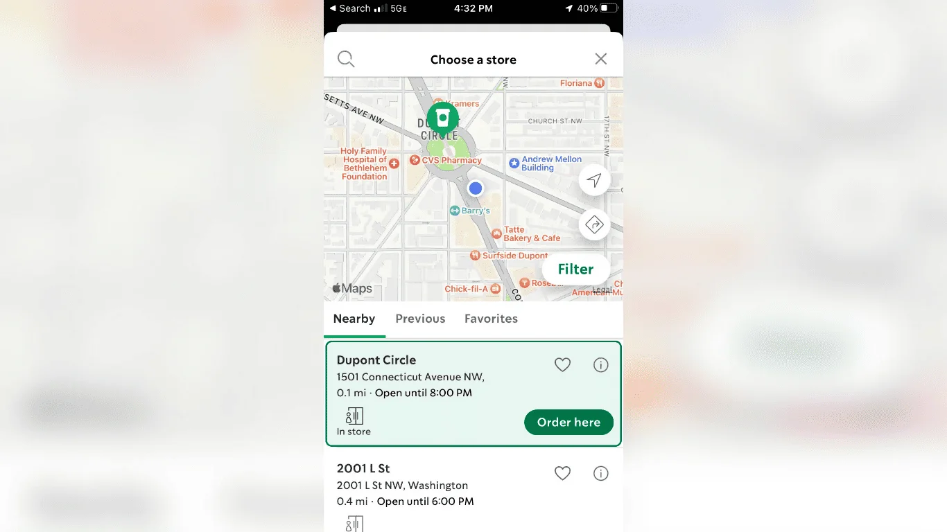
3. Gmail (Mobile-First)
Gmail’s interface (Source: GCFGlobal)
Gmail’s mobile web client displays a list of recent inbox messages before rendering complex labels or promotional tabs, letting users scan and manage email quickly on slower connections.
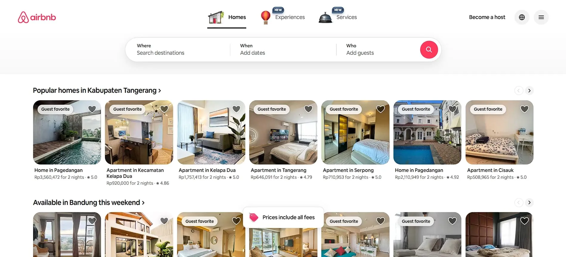
4. Airbnb (Responsive)
Airbnb’s website interface (Source: Airbnb)
Airbnb uses responsive and reactive web design principles to maintain consistent listing layouts from desktop to smartphones, leveraging fluid grids and scalable images that adapt seamlessly across screen sizes.
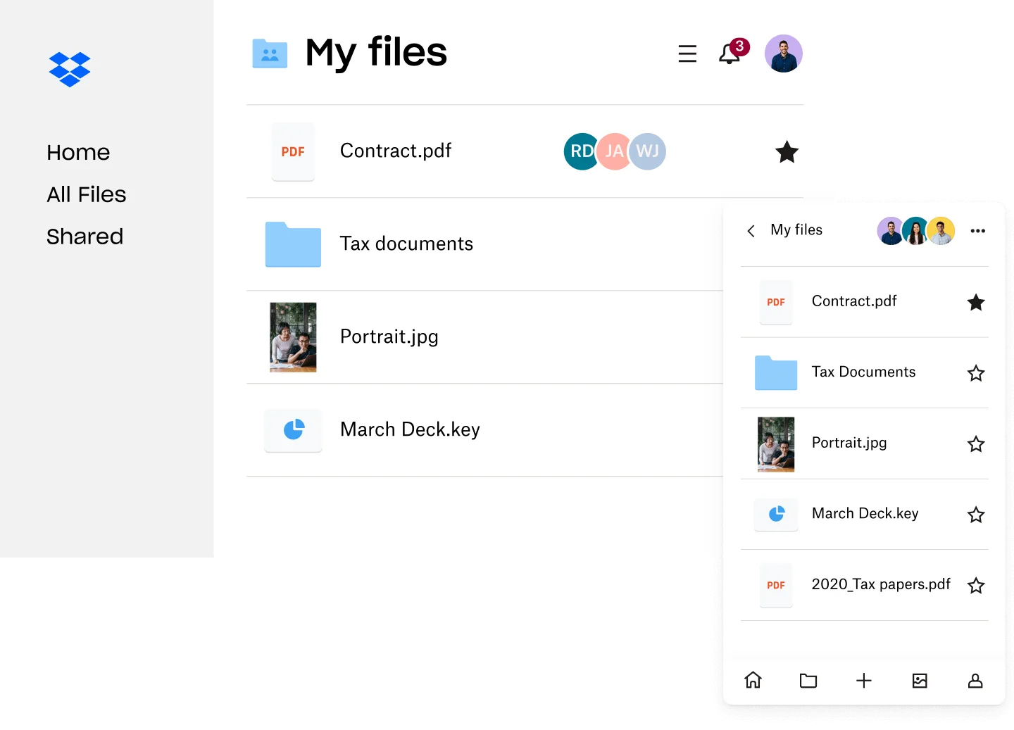
5. Dropbox (Responsive)
Dropbox’s interface (Source: Dropbox)
Dropbox uses responsive techniques to reorganize navigation and file previews, ensuring desktop-grade functionality persists even on mobile devices.
6. GitHub (Responsive)
GitHub’s interface (Source: GitHub)
GitHub applies responsive design to its repository pages, using flexible tables and collapsible sidebars that rearrange content intuitively as viewport dimensions change.
Choosing between mobile first vs responsive design depends on your project’s goals, audience, and content strategy. Ultimately, the key to a successful website lies in balancing seamless usability with a consistent brand experience.
To enhance your project further, explore 3D design resources from Tridimensi. Our stunning assets are optimized for mobile-first and responsive designs, helping you add depth, realism, and creativity to your website like never before. Discover our collection today and elevate your next project with designs that truly engage.