SPECIAL OFFER ✦ BUY 2 GET 1 FREE! ✦ ADD 3 PRODUCTS TO YOUR CART, AND THE DISCOUNT APPLIES AUTOMATICALLY!
SPECIAL OFFER ✦ BUY 2 GET 1 FREE! ✦ ADD 3 PRODUCTS TO YOUR CART, AND THE DISCOUNT APPLIES AUTOMATICALLY!
SPECIAL OFFER ✦ BUY 2 GET 1 FREE! ✦ ADD 3 PRODUCTS TO YOUR CART, AND THE DISCOUNT APPLIES AUTOMATICALLY!
SPECIAL OFFER ✦ BUY 2 GET 1 FREE! ✦ ADD 3 PRODUCTS TO YOUR CART, AND THE DISCOUNT APPLIES AUTOMATICALLY!
Among today’s UI trends, bento grid design stands out for its ability to combine visual appeal with functionality. Inspired by Japanese bento lunch boxes, this layout helps designers organize content into clean, easy-to-scan sections. In this article, we’ll explore its origins, functions, and real-world examples you can use for inspiration.
Key Takeaways:
Bento grid layoutorganizes content into modular sections, creating clean and easy-to-scan interfaces.
Its popularity comes from improving navigation, visual hierarchy, and content readability.
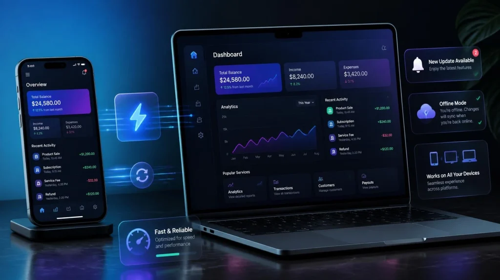
Bento grid design works well across websites, software, and mobile apps.
What Is Bento Grid Design?
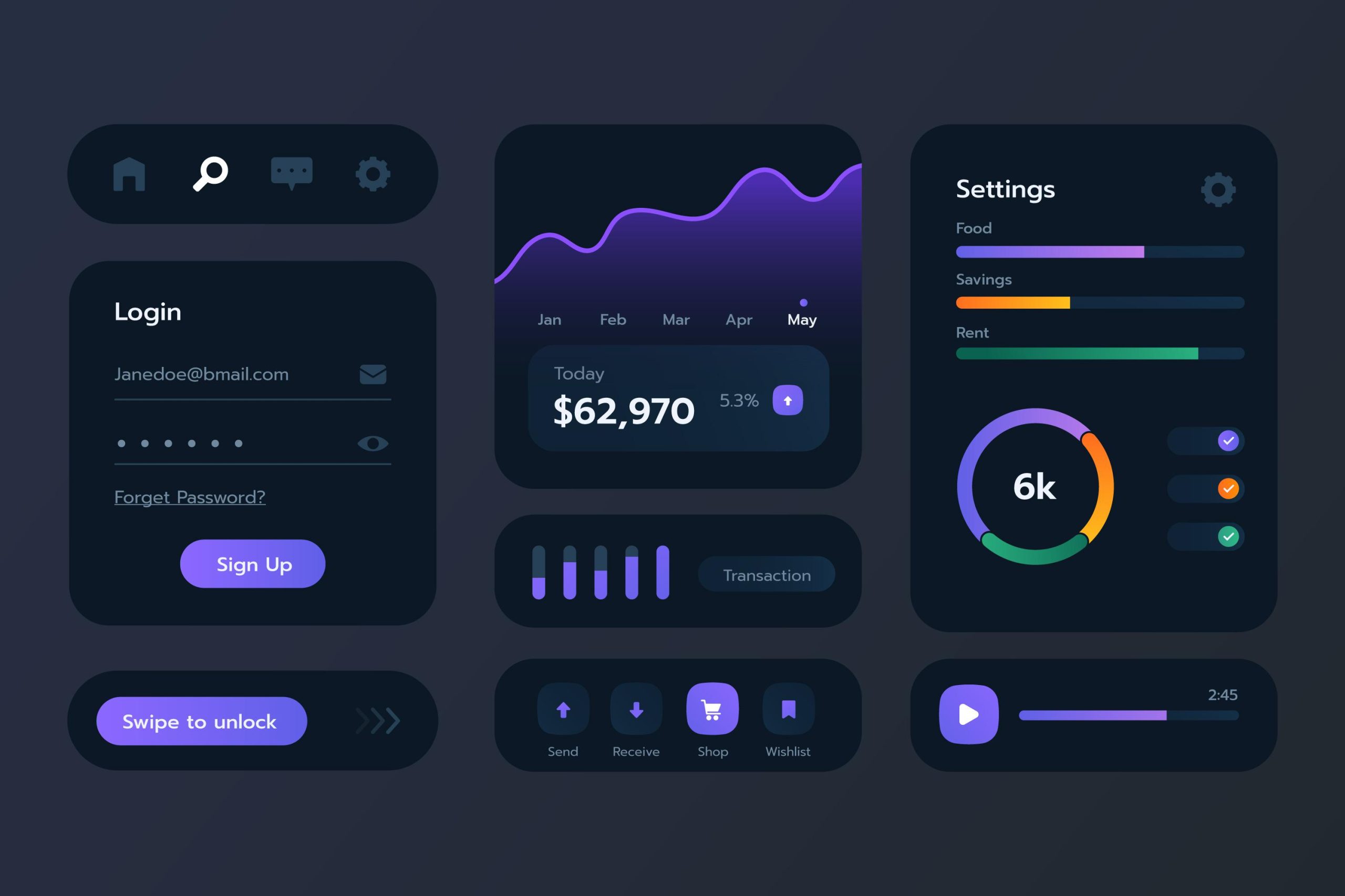
Bento grid design is a layout style inspired by the traditional Japanese bento lunch box. It organizes various types of content, such as text, images, videos, and icons, into segmented cards within a structured grid. This approach creates a clean, minimalist interface while allowing designers to present rich information in an easy-to-scan format.
Although Apple helped popularize the style through its product marketing pages, its roots can be traced back to Microsoft’s tile-based interface in Windows Phone 7. Today, bento grid style has become a widely adopted trend across websites, apps, and modern software interfaces.
Why Is Bento Grid Design So Popular?
When implemented effectively, the bento grid stylecan improve user engagement and overall UX. According to Senorit, this layout can increase time on page by 47% and click-through rates by 38%. While results may vary, its popularity mainly comes from its ability to present information engagingly.
Here are three reasons why this design style has become so popular.
1. Minimalist and Efficient
Bento grid design helps designers deliver information efficiently. Since content is divided into multiple sections, designers are encouraged to prioritize and refine what appears in each box. This makes content easier to understand and more straightforward.
2. Easy Navigation
By grouping related information, users can quickly find what they need. This creates a more intuitive browsing experience and improves overall usability.
3. Better Storytelling and Interaction
Bento grids allow designers to create more engaging presentations by arranging content around a specific narrative. The layout also works well with microinteractions, such as hover effects and subtle animations, making the experience more interactive and visually appealing.
Creating an effective bento grid layoutrequires careful planning. Without a proper structure, the layout can quickly become overcrowded, overwhelming, and difficult to navigate. Follow these core principles to create a clean and functional interface.
Bento Grid Layout (Source: Beaver Builder)
1. Modular Sections
The main bento grid component is its modular sections. Each piece of content should be placed in its own box, with sizes varying based on its importance. Despite their differences, all modules should be arranged harmoniously to maintain a balanced and visually appealing layout.
2. Consistent Margins
Consistent spacing is essential for creating a polished design. Keep margins and padding uniform to maintain a cohesive and organized layout.
3. Visual Hierarchy
Arrange content according to its importance. Place key information in larger modules and supporting content in smaller ones so users can quickly scan the interface.
4. Responsive Design
Bento grid layouts should remain responsive across different screen sizes. Adapting the design for multiple devices ensures a consistent viewing experience and better usability.
5. Clear Content Grouping
Although bento grids can display various types of media, related content should stay close together. Avoid adding too many elements to prevent users from feeling overwhelmed.
10 Bento Grid Design Examples That Use the Layout Effectively
From operating systems to websites and mobile apps, bento UI grid design has been widely adopted across digital products. Here are 10 examples that showcase the style effectively.
1. Windows 10
Windows 10 start menu (Source: PC Mag)
Windows 10 organizes apps and shortcuts into different-sized tiles, making the Start menu easy to scan without overwhelming users. This layout also helps prioritize frequently used applications.
2. SmartThings
SmartThings UI (Source: Samsung Mobile Press)
SmartThings uses modular cards to display connected devices and controls. By grouping related actions, users can quickly manage their smart home devices.
3. Walmart
Walmart’s product offers (Source: Walmart)
Walmart uses bento-inspired sections to highlight promotions, recommendations, and seasonal offers. The varied card sizes help draw attention to important deals.
Steam combines large featured banners with smaller recommendation cards to showcase games. This layout makes personalized suggestions more noticeable and easier to explore.
5. Alfa Bank
Alfa Bank homepage (Source: Alfa Bank)
Alfa Bank uses modular sections to organize financial products and services. This structure improves navigation and helps users quickly find the information they need.
6. Stripe
Stripe’s blog and customer review (Source: Stripe)
Stripe uses bento-style layouts on its marketing pages to present customer stories, statistics, and product features. Breaking information into separate cards makes content easier to digest.
Givingli uses varying card sizes to organize tools and features. This creates a more engaging dashboard while keeping important actions accessible.
8. Apple Fitness
Apple Fitness UI (Source: Apple)
Apple Fitness organizes workout metrics, activity rings, and recommendations into modular cards. This helps users quickly understand their health data at a glance.
9. Spotify
Spotify Desktop UI (Source: Inkl)
Spotify uses a modular layout to display playlists, albums, and personalized recommendations. Grouping related content creates a more intuitive browsing experience.
10. Pinterest
Pinterest UI (Source: Medium)
Although Pinterest uses a masonry layout rather than a true bento grid, it shares similar principles by organizing visual content into easy-to-scan sections. This allows users to browse a large number of images efficiently.
Are You Ready to Adopt Bento Grid Design for Your Next Project?
Bento grid design is more than simply placing content into boxes. It is about organizing information in a way that feels structured, harmonious, and easy to navigate. By combining modular layouts, strong visual hierarchy, and responsive design, this style can help create more engaging user experiences.
If you’re ready to experiment with this trend, don’t overlook the importance of supporting visuals. Since bento grids often rely on eye-catching elements, using high-quality visual assets can make your interface feel more dynamic and interactive. Visit Tridimensi to discover assets that can complement your next bento grid design project.